Key Takeaways (TL;DR):
The 1-3-7 Framework: Focus on 1 primary offer, 3 visible links, and a 7-day optimization loop to maximize conversion velocity.
Offer Selection: Choose a low-friction product (under $50) with instant delivery that directly aligns with your most recent social media content.
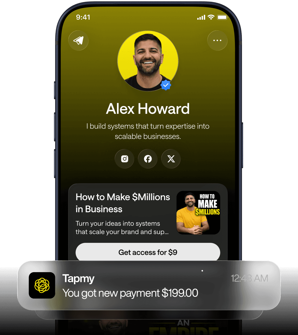
The Three-Link Rule: Limit your bio to three destinations: the primary paid offer, a lead magnet (email capture), and a link to your main content hub.
Mobile-First Optimization: Design for small screens using large CTA buttons, concise microcopy, and a streamlined payment process to reduce abandonment.
Iterative Testing: Use the first week to establish a baseline and change only one variable at a time (like headline copy or button color) to accurately measure what drives sales.
Data-Driven Growth: Only expand beyond the single-offer strategy once you achieve a consistent 1–2% conversion rate and have automated your fulfillment process.
Why a single-offer link in bio beats the ten-link approach
Most beginners copy feeds they admire and load their bio link with everything: shop, blog, affiliate, newsletter, merch, calendar, videos. It feels comprehensive. It is not. For creators under 5K followers with no prior monetization history, breadth dilutes attention. A focused approach — one main offer, three visible links, seven-day optimization — forces decisions that raise conversion velocity. Call that the 1-3-7 beginner framework: 1 main offer to sell, 3 visible destinations on the bio page, and a 7-day loop of measurement and small iterations.
Why does this pattern work? At the simplest level, attention is scarce. Visitors coming from a short-form video are not in the mood to browse an entire product catalog. They want a single next action that matches the content that brought them there. So you design to convert the next micro-intent, not to host your entire creator identity under one roof.
There’s another mechanism at play: signal-to-noise in your analytics. With a single primary offer you cut down attribution ambiguity. You can more clearly correlate traffic quality to conversion rates. Think of monetization layer as a stack: attribution + offers + funnel logic + repeat revenue. If attribution data is messy because you offered ten choices, the offer layer cannot be optimized confidently. Tracking shows you what visitors click, and when the choices are few, those signals are actionable.
Still, there are trade-offs. Buyers with broad purchase intent might get turned off by a narrow menu. For some niches where discovery drives sales (ebooks, courses), a small catalog could under-serve demand. That said, for the first $1,000 the problem most creators face is not being too narrow — it’s not being focused enough to produce any sale at all.
Choosing your first monetization offer: criteria, examples, and common mistakes
Picking the first offer should be an empirical, not emotional, exercise. You're testing product-market fit at micro scale. The correct question: which single offer gives you the shortest path from posted content to a completed transaction?
Use these criteria in order of priority:
Low purchase friction — price point under $50, instant delivery (digital download, PDF, link, or booking page)
Clear alignment with recent content — the offer solves a problem your last 3–5 posts hinted at
Updateable — you can iterate on copy, price, or bonuses within days
Attributable — you can link directly and track clicks to that specific offer
Common first-offer types that fit these criteria: a short how-to PDF, a template pack, a mini course or workshop, a 15–30 minute paid consult, or an entry-level physical product with simple fulfillment (print-on-demand mug or sticker pack). Pick one.
What often breaks in real usage: creators choose an offer they think is "cool" rather than an offer that maps to their audience intent. Another pattern: the offer is too complex to deliver (multi-part course, custom services) and fulfillment delays kill trust. Repeat: early offers must be simple to set up and simple to deliver.
Example: A food creator who posts short recipes might convert faster selling a 10-recipe PDF (instant download) priced at $7 than offering a month-long paid subscription. Lower price, immediate gratification, and higher decision rate.
The 3-link beginner framework and essential page elements
Three visible links is a ceiling, not a suggestion. It includes the primary offer, a low-friction lead capture, and one content or social hub link. This limits visitor choice while preserving utility.
Order matters. Arrange links in priority order, with labels that match user intent from your content. Use plain language: "Buy [Offer Name] — $7", "Get the free checklist", "See the latest video". Remove marketing-speak.
Essential page elements to include — and why:
Above-the-fold CTA: a single button and a one-line value proposition. Mobile screens are small; visitors should see the action within a thumb swipe.
Social proof: if you have any, show a short testimonial or user count. Keep it real; exaggerated claims erode trust.
Microcopy that reduces friction: delivery details ("instant PDF"), refund policy notes ("no refunds for $7 download"), and payment methods supported.
Minimal navigation: no long menus, no autoplay videos. Every extra click is potential abandonment.
How to use your three links, practically:
Primary paid offer — the single thing you're optimizing to convert.
Lead capture — a free checklist or short email mini-course tied to the same theme as the paid offer.
Content anchor — link to the platform where you publish most often (Instagram/TikTok/YouTube) to preserve brand continuity.
Design note: Use contrast on the primary CTA button; secondary links can be text-only. Keep everything readable at 15–18px equivalent on mobile. Test in a real device. Desktop impressions don't matter for most creators with short-form audiences.
Setting up payment processing and platform-specific constraints
Payment flow is where friction kills conversions. Choose a processor that lets you create a single-click, shareable payment link with instant delivery. For most beginners that means Stripe/PayPal Checkout, Gumroad, or a lightweight commerce tool that supports links. What matters is the end-to-end experience: click → pay → receive product immediately.
Platform constraints should guide your choice. Instagram allows one bio link and limits clickable links in captions; TikTok similarly restricts link placement unless you have a business account in some regions. YouTube descriptions are link-friendly but often require scrolling. Each platform sends different intent signals: a TikTok viewer may be higher in browsing mode than an Instagram follower who already trusts you more.
Below is a qualitative comparison table of platform differences that affect how you set up your link in bio and choose a payment method.
Platform | Primary constraint | Typical visitor intent | Best link practice |
|---|---|---|---|
One clickable bio link; captions not linkable | Existing followers, slightly higher trust | Single offer link with clear CTA; use Stories to promote | |
One clickable bio link; captions not linkable | Existing followers, slightly higher trust | Single offer link with clear CTA; use Stories to promote | |
TikTok | Links limited for small accounts; requires switching to certain account types | Discovery-first; short attention spans | Use in-video calls-to-action and pinned comment to direct to bio |
YouTube (shorts) | Links in description; might be hidden unless expanded | Search/discovery; intent varies | Place link in top description with timestamp context |
Twitter/X | Bio link plus in-post links okay | Conversational, link-friendly | Use bio for evergreen offer and tweets for specific promotions |
Payment method decision matrix (qualitative) — two short notes:
Option | Strength | Weakness | When to pick |
|---|---|---|---|
Stripe Checkout | Fast, customizable receipt and hosting for digital links | Requires basic setup; payout schedules vary | If you can add code or use an integration platform |
PayPal Payment Link | Familiar to customers; quick link generation | UX can feel transactional; fees similar | When you need a fast, no-code link |
Gumroad/Buy Me a Coffee | Quick setup, built-in delivery and membership options | Platform fees; branding is present | If you prefer a managed delivery experience |
Constraints to anticipate: payout delays, dispute processes, geographic availability (some processors are unavailable in certain countries), and KYC verification timelines. If your account sits unverified for days, that can block checkout. Plan for these delays when you announce a paid offer.
Why conversion benchmarks matter and what realistic beginners should expect
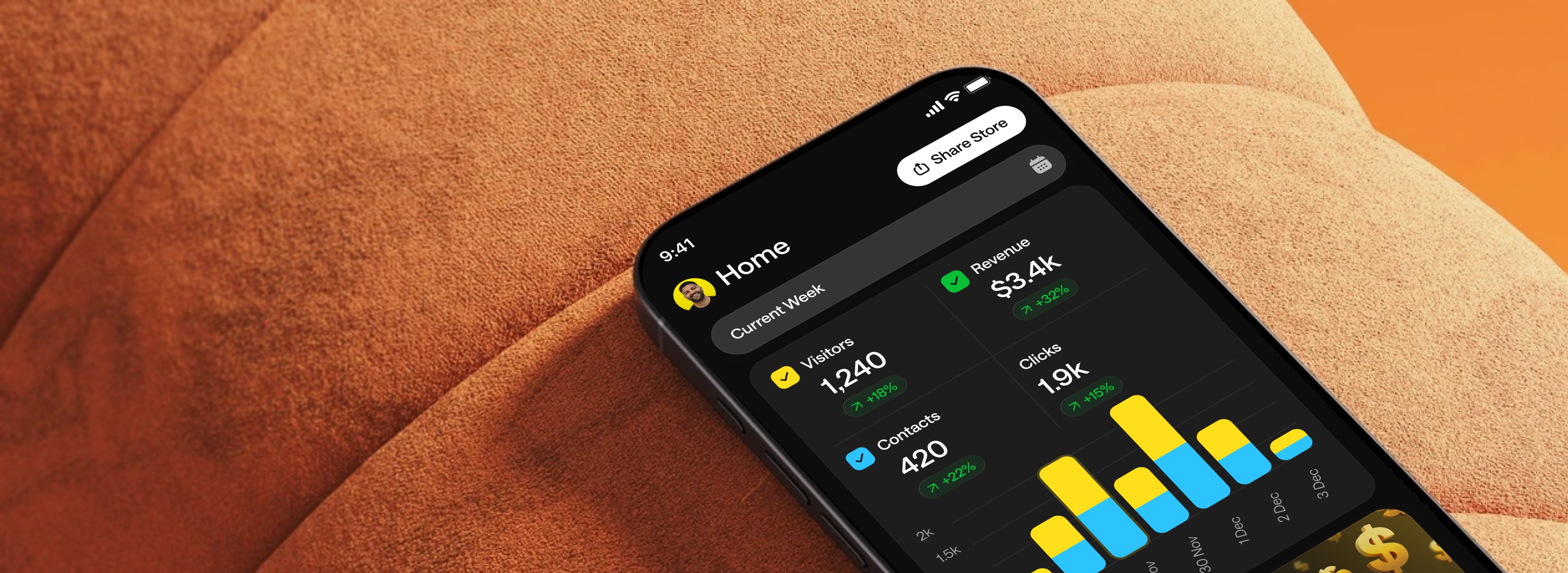
Benchmarks remove magical thinking. For creators with under 5K followers and little monetization history, expect roughly 1–2% visitor-to-purchase in the first 30 days if you run a single-offer test and your traffic is untargeted. That range is not an absolute law; it's an empirical observation that helps set pacing and cashflow expectations.
Another useful data point: when creators adopt a focused single-offer strategy, about 70% make a first sale within 14 days. This isn't guaranteed. It reflects behavior: once you reduce decision paths and set up a clear delivery experience, you make it possible for curious followers to complete a transaction quickly.
Why conversion is low initially:
Trust is nascent. Followers haven't yet paid you before.
Traffic quality varies. Viral views often convert worse than steady followers.
Pages are unoptimized. Small changes in copy or button placement materially move the dial.
Use these benchmarks not as fixed goals but as a diagnostic. If your conversion is 0.1% after two weeks, you're not failing — you're diagnosing: low intent, broken checkout, or a misaligned offer. Each diagnosis points to a different fix. For more concrete comparisons, see conversion benchmarks collected across creators.
What breaks in real usage: common failure modes and subtle bugs
Expect the messy reality. Clean theory rarely survives traffic. Here are the most common failure modes and why they happen.
What people try | What breaks | Why it breaks |
|---|---|---|
No clicks concentrate on the paid offer | Choice overload; analytics signals spread thin | |
Complex checkout flow | Checkout friction—extra fields, slow pages, or poor mobile UX | |
Generic CTA text ("Click here") | Low click-through rates from bio | Unclear value proposition; mismatch with content intent |
Delayed product delivery | Refunds, chargebacks, and trust erosion | Fulfillment not automated; creator overloaded |
Some issues are invisible until load increases. For example, a free email checklist delivered via an email automation could be throttled by limits in the free plan of your email provider. Or, your payment link works, but the receipt email lands in spam because you didn't set up a proper sender domain. Those are ops problems often missed during launch.
Another subtle failure: attribution mismatch. You promote an offer in a video and direct viewers to "link in bio," but they arrive via a different path (pinned post, search). If your analytics lumps all traffic together without source distinctions, you won't know which creative performed. Use UTM parameters or link tools that capture the original referrer where possible.
Mobile-first design basics and microcopy that converts
Nearly all link-in-bio traffic will land on a mobile device. Penalizing desktop-first assumptions is a common rookie mistake. Design for big thumbs, one-handed scrolling, and attention windows under 8 seconds.
Practical rules:
Keep the hero copy to one line. If you need a subline, make it a single short sentence.
CTAs must be reachable with the thumb. Place them within the bottom third of the viewport when appropriate.
Button labels should state the outcome not the action. "Get the PDF" is better than "Download".
Test on cheap devices. Emulators lie; use a real mid-range phone and a tablet if possible.
Microcopy examples that address objections:
"Instant PDF — no wait."
"Only $7 — secure payment with PayPal or card."
"Join 200 others — delivered via email in under a minute."
Don't overpromise. If delivery requires manual steps, say so. Transparency reduces refund risk and builds repeat buyers.
Email capture strategy and the role of the lead magnet in the 1-3-7 loop
If the primary offer is the revenue lever, the lead magnet is your learning lever. The goal of the lead magnet is to collect an email that lets you continue the conversation after the visitor leaves. For beginners, a simple checklist, a short template, or a mini-email course works best.
Make the lead magnet derivative from the paid offer. If your paid product is a 10-recipe PDF, the lead magnet could be a 3-recipe “starter pack” that previews the paid product. That alignment reduces cognitive dissonance and increases the chance of a follow-up purchase.
Key implementation details:
Use a double opt-in if your email provider suggests it, but be aware it reduces signups. For first tests, single opt-in improves conversion; weigh deliverability risks.
Automate delivery immediately. The second email is the one where you introduce the paid offer — do it within 24 hours.
Track open and click rates from the lead magnet sequence. If people open but don’t click, the offer pitch is the bottleneck; consider changing the anchor text and benefit statement.
One behavioral tactic: a "lead-to-paid" email flow that starts with value and ends with an exclusive, time-limited offer. Keep the discount small or offer a small bonus (extra template, short Q&A) rather than slashing price. The goal is to preserve perceived value while nudging conversion.
Week 1 optimization plan: the 7-day loop made practical
The 7-day optimization cycle is not a waterfall project plan. It’s a rapid, accountable rhythm: measure daily, change one variable, measure again. Keep iterations small. Big shifts obscure which change moved the metric.
Day-by-day example schedule for week one (practical and blunt):
Day 1 — Baseline: Launch with your single offer, set up payment link, add 3-link page, and confirm mobile rendering. Record baseline metrics: visits, clicks on each link, add-to-cart or payment initiation, completed purchases.
Day 2 — Traffic and microcopy: Drive initial promotion (one post and one story/pinned comment). If conversion is below 1%, rewrite the primary CTA and hero line to more explicit benefit language.
Day 3 — Checkout friction: Simulate checkout across devices. Remove any optional fields. If abandonment is high, switch processors (e.g., from hosted checkout to a simpler payment link).
Day 4 — Lead magnet push: Send a short email to new signups offering a small bonus and a direct link to the paid offer. Track email click-throughs.
Day 5 — Creative variation: Change the headline on the bio page and the CTA label. Keep everything else identical.
Day 6 — Social proof and urgency: Add a real testimonial or display the number of downloads (if any) and include a short time-limited bonus (expires in 48 hours). Small scarcity cues matter here; don't manufacture false urgency.
Day 7 — Review and decide: Compare day 1 metrics to day 7. If conversion improved, double down on the last change. If not, revisit the offer-market fit question.
One practical caveat: don't iterate on multiple variables at once. If you change the CTA and the price on Day 5, you won't know which change mattered. Use the 7-day cycle to run 1–2 controlled experiments. For scheduling and pricing experiments you can reference 7-day and 30-day challenge structures and use daily logs to measure and improve performance.
Platform-specific setup notes and attribution best practices
Each platform injects subtle constraints into the funnel. Here are actionable set-up notes for the most common sources of creators' traffic.
Instagram: Use the pinned story link (if available) to highlight the current offer. In captions, use exact callouts like "link in bio — buy the [offer]" rather than "check the link". Add UTM parameters so you can separate organic post clicks from story clicks.
TikTok: If link access is limited, direct viewers to the pinned comment and to a specific phrase they can search for. Track referrers in the payment link if possible; otherwise, rely on timing correlation. See our TikTok bio link strategy for examples.
YouTube: Put the offer in the top of the description and in a pinned comment. Use a short memorable slug in your link text for viewers who watch on TV or desktop. Compare best practices in YouTube link placements.
Email and DMs: When a follower DMs expressing interest, send the exact same link you use in your bio. That keeps the checkout experience consistent and your attribution clean.
Best practice: always append a UTM or similar parameter to the main offer link when promoting from a new creative. If your link-in-bio tool or payment provider strips parameters, use intermediary redirect pages that preserve these tags. Without source clarity you'll misallocate promotional energy.
Decision matrix: when to expand beyond the 1-3-7 framework
Staying focused is necessary early but not forever. Expand when measurable conditions are met. Use this checklist — if you answer "yes" to two or more, consider a second offer or a modest increase in visible links.
Condition | Why it matters |
|---|---|
Primary offer reliably converts above ~2% over a sustained 30-day window | Indicates product-market match and operational capacity |
Email list shows consistent open and click activity (repeat engagement) | You have an owned channel to promote a second offer |
You can automate fulfillment without manual bottlenecks | Prevents service-quality issues when you increase volume |
When you expand, add offers thoughtfully: complementary products, entry-level upsells, or a subscription tier. Each new offer should play a clear role in the monetization layer: attribution + offers + funnel logic + repeat revenue.
FAQ
How quickly should I expect my first sale after setting up my link in bio?
Many creators who follow a focused single-offer path see a first sale within two weeks; the often-cited figure is roughly 70% within 14 days, but that's conditional. If your posts drive targeted traffic and your offer is low-friction, the timeline shortens. If traffic is primarily viral and untargeted, or your checkout introduces friction, expect longer. Use the first 14 days as a diagnostic period rather than a binary success/failure judgment.
Is a free lead magnet necessary before offering a paid product?
No, not strictly. If you can sell directly from trust generated by content, skip the free magnet. That said, a lead magnet accelerates learning: you collect email addresses and can convert later. For beginners, pairing a low-priced paid product with a small free magnet tied to the same theme often produces the best trade-off between immediate revenue and list growth.
What pricing strategy should a new creator use for their first offer?
Price for quick decisions. For most creators under 5K followers, the pragmatic range is low enough to remove purchase friction — think one-time prices under $50. Price too low and you risk signal problems (perceived value drops); price too high and you reduce the pool of buyers. Start modest, measure response, then iterate. Discounts and limited-time bonuses work better as add-ons than headline price cuts.
How do I measure whether my bio page or my social post is the problem when conversions are low?
Split the problem by isolating variables. Change one thing at a time: rewrite your bio page headline while keeping promotion constant. Then switch the creative but keep the bio page stable. Measure and improve using UTM parameters; if your tool captures referrer and click paths, use that. When analytics are limited, use timing: promote the same offer with two different posts spaced apart and compare conversion per post. It's not perfect, but you will learn which part of the funnel deserves attention. Also review UTM parameters to keep source clarity.
When should I stop using the 3-link rule and add more links?
Add links only when you have reliable metrics that justify it. If your primary offer converts and you have an email funnel that's engaged, then a second link (an upsell or subscription) can make sense. Avoid adding links simply because the tool allows it. Each new destination complicates attribution and scatters attention — the exact things you worked to eliminate early on.


