


" height="21.95706114703747px" id="qM5sFNDIS" transform="translate(3.459 1.023)" width="17.081538493872166px"/></svg>)
" height="16.041644077985946px" id="vPwWmgEb7" transform="translate(2.375 4.207)" width="19.249983003077222px"/></svg>)
" width="20px"><path d="M 0 20 L 0 0 L 20 0 L 20 20 Z" fill="transparent" height="20px" id="Iu2kCeaUT" width="20px"/><path d="M 4.531 6.206 L 0.253 6.206 L 0.253 19.08 L 4.531 19.08 Z M 2.393 4.449 C 3.884 4.449 4.813 3.46 4.813 2.224 C 4.785 0.961 3.884 0 2.421 0 C 0.957 0 0 0.961 0 2.224 C 0 3.46 0.929 4.449 2.364 4.449 Z M 11.178 19.08 L 11.178 11.89 C 11.178 11.506 11.206 11.121 11.319 10.847 C 11.628 10.077 12.333 9.281 13.515 9.281 C 15.063 9.281 15.682 10.462 15.682 12.193 L 15.682 19.08 L 19.961 19.08 L 19.961 11.698 C 19.961 7.744 17.85 5.904 15.034 5.904 C 12.765 5.904 11.747 7.152 11.178 8.029 L 11.178 6.206 L 6.899 6.206 C 6.956 7.414 6.899 19.08 6.899 19.08 Z" fill="rgb(0, 0, 0)" height="19.079659942779543px" id="hzLTqQuQE" transform="translate(0.02 0.461)" width="19.960870207061767px"/></g></svg>)
" height="18px" id="TrPl6m2Z8" transform="translate(1.75 3)" width="20.5px"/></svg>)
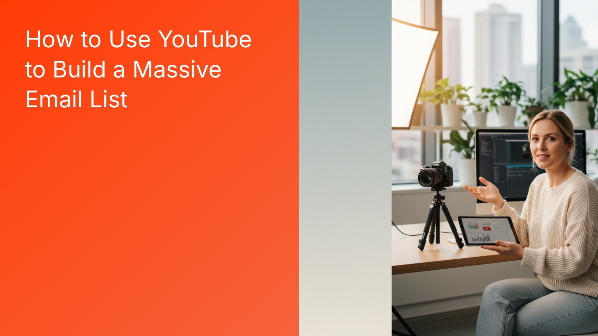
Key Takeaways (TL;DR):
Optimize Description Placement: Place your primary opt-in link within the first two lines of the description to ensure it is visible on mobile devices before the 'Show more' truncation.
Leverage Specific Lead Magnets: High-conversion assets like checklists, templates, or presets should directly solve the problem or continue the tutorial presented in the video.
Time Your CTAs: Use pinned comments for early engagement (first few hours), cards during attention spikes, and end screens for viewers who have completed the video.
Reduce Choice Overload: Focus on one primary call-to-action (CTA) per video to prevent decision paralysis and use a consolidated 'storefront' or landing page link.
Standardize Attribution: Use canonical links and UTM parameters consistently across all placements and collaborations to accurately measure which videos and partners are driving signups.
Placement and copy: how description links drive signups (and why positioning rules still surprise creators)
Most creators treat the video description like an afterthought: a sea of timestamps, affiliate links, and the occasional “subscribe” sentence. That is why a tight YouTube email list strategy begins with placement and language. The description is not a billboard; it's a micro-conversion funnel that mediates search intent into an action you control. If you want to grow email list with YouTube, the description must do three things simultaneously: tell the viewer what they get, remove friction to clicking, and signal credibility.
Start with placement. Pins and top-line links get more attention than buried links. Put the single highest-value link within the first one or two lines (the preview). YouTube truncates descriptions in many contexts; that top line is what mobile viewers see before tapping "Show more." Use that line for your opt-in anchor text, not a vague URL. Anchor text that maps directly to search intent converts better — e.g., "Get the [X] checklist I used in this video" beats "Sign up here."
Copy matters. Somewhere between headline and product description is the sweet spot: a one-sentence benefit, one social-proof clause (brief), and the call to action. Keep the verb active and specific. Avoid generic language — “Join my newsletter” is weaker than “Download the 7-minute template that stops procrastination.” The former signals a promise you must still prove. The latter names an outcome and an asset.
Creators often ask whether to link directly to an email capture page or to a broader bio-link/storefront. Both choices are defensible. Practical reality: a single link that functions as a monetization layer — combining attribution, offers, funnel logic, and repeat revenue — increases the conversion value of each click because it gives visitors multiple action paths (email capture included). That is why many creators choose a link that surfaces their email signup alongside social proof and product offers instead of a bare signup form.
On the mechanics of visibility, YouTube shows different parts of the description depending on device and embed context. Desktop users see more lines by default; mobile is stingy. Keep the primary CTA and the anchor text in the previewable area. If you must include affiliate or sponsor links, place them below the opt-in link. That ordering prevents the primary CTA from being crowded out by low-conversion links.
Finally, be deliberate about link types. A long UTM-laden URL can look off-putting if shown in preview. Short, readable anchors with a clear promise convert more. If your platform requires a longer URL, consider using a vanity path from your storefront or link service so the preview text is friendly and trustworthy.
End screens, cards, and pinned comments: timing the CTA with viewer attention
Different YouTube placements reach viewers at different cognitive states. Understanding that mismatch is necessary if you want YouTube to email subscribers rather than just drive views. End screens reach users at the moment they’ve finished consuming — decision time. Cards hit during consumption. Pinned comments capture early engagement, particularly in the first hour after publish.
End screens are precise but constrained. They only appear in the final 5–20 seconds and require the viewer to stay through the entire video to see them. When they work, they convert because the viewer is already primed. When they fail, it's usually because creators place a generic "subscribe" or "watch next" instead of a focused opt-in CTA. Treat end screens like a last-chance prompt: the copy should mirror the video promise and offer an asset that extends the viewer's momentum.
Cards are underrated for list-building. Unlike end screens, they can be triggered at any point. But choosing the trigger time is an art. Put cards where attention spikes — an aha moment, a pivot, a revelation. Cards are less visible on mobile; still, for viewers who intermittently watch long-form content, a well-timed card can be the nudge that moves someone to click and then subscribe.
Pinned comments anchor the conversation and show up near the top of the comment feed. They work best during the "peak engagement window" — typically the first few hours after a new upload. Expect the majority of comment-driven clicks to occur early. After that, the pinned comment’s relative impact drifts down as more comments accumulate and the thread moves.
What does this mean for action? Use a coordinated placement strategy. Launch with a pinned comment linking to your primary storefront or opt-in, set a card at an attention spike, and reserve the end screen for a high-value asset tied to the video. That combination maps the viewer’s cognitive curve to multiple chances to act.
Placement | Viewer state | Best copy approach | Typical failure mode |
|---|---|---|---|
Description (top line) | Before click / while scanning | Short benefit + clear CTA + vanity link | Buried under timestamps or sponsor links |
End screen | After consumption / primed | Specific offer that continues the video outcome | Generic CTAs, timing mismatch |
Cards | During consumption / attention spike | Contextual, micro-targeted CTA | Poor timing or low visibility on mobile |
Pinned comment | Early engagement window | Short hook + link + social proof | Posted too late or buried by replies |
When you design copy for each placement, resist the urge to make every CTA identical. Test variants that match the viewer's mental model at that point: the description might sell utility, the card tests curiosity, the end screen asks for commitment, the pinned comment invites conversation and a low-friction click.
Designing YouTube-specific lead magnets: matching search intent to the subscribe trigger
Not all lead magnets are equal on YouTube. A downloadable PDF works in one niche and feels irrelevant in another. Matching search intent to the asset type — the SERP-to-Subscribe pipeline — is where creators get disproportionate lift.
Begin by mapping the video's search intent: informational, navigational, or transactional. A viewer searching "how to color grade in DaVinci Resolve" is highly primed for a checklist or LUT pack. Someone querying "best podcast mics 2026" may prefer a comparison spreadsheet or a short buying guide. Your lead magnet should feel like the natural next step from the query that brought the viewer in.
Architecturally, the pipeline has three nodes: discovery (YouTube SERP), engagement (video watch), and conversion (email opt-in). The asset occupies the bridge between engagement and conversion. A bad bridge is generic — "Get my free guide" — while a good one is explicit — "Download the exact DaVinci Resolve LUTs used in this tutorial." The latter reduces the cognitive friction; it clarifies what happens after click and why the viewer should care.
Formats matter for friction and perceived value. Quick templates, one-page checklists, and time-saving scripts tend to convert because they promise immediate utility. Toolkits, bundled templates, or small digital products can command an opt-in plus an entry-level purchase. If you are trying to grow email list with YouTube and monetize later, consider a two-step approach: low-friction free asset first, paid upsell after automated onboarding.
One pragmatic pattern that scales: the "watch this video, get this resource" formula. The video demonstrates the problem and gives a taste of the solution. The resource completes the solution in a compact form. That alignment is why many creators see higher conversion when the lead magnet is a concrete continuation of the tutorial rather than an unrelated newsletter.
For creators without a website, a single storefront link that surfaces the lead magnet alongside social proof and other offers simplifies the architecture. It also consolidates attribution and reduces the cognitive load on the viewer: one click, multiple credible actions. See practical options for creators who don't want to manage a landing page in the guide on email list building without a website.
Search Intent | High-converting asset | Why it works | When to avoid |
|---|---|---|---|
How-to / tutorial | Templates, presets, checklists | Completes the tutorial; immediate utility | If asset is too large or off-topic |
Product comparison | Decision spreadsheet, quick buying guide | Saves time and reduces buyer anxiety | If the audience already knows choices |
Trend / news | Curated resource list, curated clips | Compiles scattered info; time saver | Topics with short shelf life |
Finally, think about delivery. An email-first delivery — the asset sent to inbox after signup — increases list value because it forces a double engagement (click and open). Automated sequences can then nurture that relationship. If you want practical playbooks for automation sequences that sell while you sleep, consult resources on email automation for creators.
Collaborations, community posts, and cross-promotion: when guest appearances actually grow your email list
Creators often treat collaborations as a pure subscriber-arbitrage play: "If my guest is big, I'll get subscribers." That can work for channel growth, but list growth behaves differently. Email opt-ins depend on intent and value alignment; the guest appearance must attract viewers who want the asset on offer, not just casual lurkers.
Pick collaborators whose audience searches for or consumes the same problem space. If your lead magnet is a productivity template for video shoots, a guest on a filmmaking channel is better than a crossover to a general lifestyle creator, even if the latter has larger raw reach. In other words: quality of intent beats quantity of eyeballs.
Use cross-channel assets as shared hooks: a co-created checklist, a joint webinar, or a split-traffic landing asset. When both creators promote the same lead magnet, you get compounded trust: viewers see the asset promoted by two sources and are more likely to click. But you must coordinate messaging and ensure the link you use is consistent across descriptions and pinned comments — that consistency preserves UTM data and reduces attribution leakage.
Community posts are underused for list-building on established channels. For creators with access to the community tab, a direct post linking to a new asset can reach subscribers who missed the video or prefer platform-native prompts. Use community posts for follow-ups, micro-surveys, or to re-surface a high-performing video and its opt-in.
Scaling from 5K to 50K subscribers is often seen as a pure content problem. It is not. If you want to 10x your email list as you grow channel subscribers, coordinate these levers: a searchable asset-per-video strategy, consistent link placement, and systematic collaborations that funnel intent-aligned viewers to a unified storefront where email capture sits alongside other offers. The playbook that maps this progression is deliberate and repeatable — you can find week-by-week frameworks that start with zero in the parent plan on building an email list from zero.
Below is a decision matrix for collaboration formats and when to choose each depending on your growth goal.
Collab format | Best for | Pros | Cons | Sign-up strategy |
|---|---|---|---|---|
Co-created tutorial | Audience overlap; skill-based | High intent; easy asset tie-in | Time-intensive to produce | Shared checklist linked in both descriptions |
Guest cameo | Brand awareness | Low production cost | Lower conversion without asset | Joint mini-guide promoted in pinned comments |
Live webinar | High-ticket or cohort offers | High engagement; list capture during sign-up | Scheduling and tech friction | Registration sends email plus immediate freebie |
Don't ignore the backend implications. Cross-promotion demands disciplined attribution. If you want to analyze which collaborations actually produced signups versus just views, combine clear UTM parameters with a single external link (your storefront) to reduce noise. For sorting tools and platform choices that fit creators, see the comparison of email tools and free vs. paid options — they’ll help you pick an architecture that scales with list size (platforms, tools).
Common failure modes and trade-offs: what breaks when you treat YouTube like an ad channel
One recurring pattern I see in audits is design mismatch: creators copy paid-ad tactics onto YouTube without adjusting for behavioral context. That rarely works. Below are specific failure modes, root causes, and how they interact with platform constraints.
Failure mode 1 — the scattershot CTA. Creators throw multiple CTAs into the description and end screens: merch, Patreon, donate, subscribe, and an opt-in. The viewer gets decision paralysis. Root cause: trying to monetize every click. Trade-off: you increase potential revenue paths but reduce opt-in conversion. A single primary CTA per video, with secondary options on the storefront, tends to outperform the shotgun approach.
Failure mode 2 — mismatch between search intent and asset. Creators with a general newsletter expect viewers from niche tutorials to sign up for a broad weekly digest. They don't. Root cause: asset-blog mismatch. Solution: create micro-assets tied to the video's query. It's fine to have a general newsletter, but the video-specific asset should be the on-ramp.
Failure mode 3 — broken funnels because of link inconsistency. Creators paste different versions of their signup link across the description, pinned comment, and social posts. The result is fragmented attribution and confusing redirects that hurt trust. Root cause: poor workflow. Use a single canonical link per video and standardize the anchor text. Consolidate redirects on a storefront if you need to present multiple options post-click.
Failure mode 4 — treating conversions as binary. A click is not a signup unless the landing experience matches expectations. If the post-click page is slow, cluttered, or has unclear next steps, you lose the conversion. Root cause: poor landing experience. A streamlined email signup landing page boosts conversion; if you prefer not to build one, a storefront that surfaces the signup alongside other social proof reduces abandonment.
Below is a practical table mapping common attempts to what breaks and why, useful when you’re debugging a funnel that feels disappointingly leakier than expected.
What people try | What breaks | Why | Where to look first |
|---|---|---|---|
Multiple CTAs in description | Low opt-in rate | Decision fatigue; attention split | Description ordering and preview line |
Pushing newsletter from every video | High unsubscribe rate | Irrelevant content to subscriber's initial intent | Asset alignment and welcome sequence |
Using different sign-up links | Attribution noise | UTM fragmentation and redirect chains | Canonical link consolidated via storefront |
Short, featureless landing page | Click drop-off | No reinforcement of the video's promise | Landing page copy and delivery mechanism |
Trade-offs are real. You can optimize for maximum signups per video by restricting CTAs and offering a single high-value asset, but you may limit immediate revenue opportunities. Or you can push multiple offers and accept lower list growth while maximizing direct sales. Both paths are valid; pick one consistent approach per campaign and measure the outcomes rather than guessing.
Two practical operational constraints to remember: first, YouTube's link preview behavior is platform-controlled — you can't force how many lines are shown in every context. Second, YouTube limits how viewers interact with certain link types (e.g., cart links or external sites may have friction). These constraints push many creators toward a single reliable landing hub. If you're exploring how bio-link or storefront strategies interplay with conversion mechanics, the guide on bio-link monetization explains how a consolidated link works for service-based creators (bio-link monetization).
On measurement: don't be complacent with raw click counts. Prioritize the ratio of click → submit → open. Clicks without follow-through are noise. If you want to set realistic growth goals for your first 90 days and see what throughput looks like, the planning resource on setting realistic email list growth targets is a good calibration point (growth goals).
Operational playbook: concrete steps for creators with 1K–50K subs to convert viewers into YouTube to email subscribers
Below is an operational playbook you can implement with modest effort. It assumes you have a store or single storefront link that houses your email capture — the consolidated-link approach discussed earlier. If you don't have that yet, there are two short routes: build a simple landing page, or use a storefront that surfaces email signup with other offers.
Workflow (week 1–2): Audit and standardize. Identify your canonical link and make that the only CTA in the top line of every description. Rewrite the description template: benefit sentence, one-line social proof, canonical link, timestamps, and then sponsorship links. Update old videos' top-line where relevant. Announce the change to your audience with a short community post or video (how to announce your list).
Workflow (week 3–6): Create three lead magnets mapped to three high-traffic queries you rank for. Keep them one-pagers or small toolkits. Set up automated delivery via your email platform and a short welcome sequence. If you need help choosing a platform that fits creator workflows, see the platforms comparison (email platforms).
Workflow (week 7–12): Run coordinated collaborations. Choose two creators with overlapping intent audiences and co-create an asset. Promote it across both channels with identical link placement and pinned comments. Track referral performance via UTM tags to the storefront to avoid attribution loss.
Measurement cadence: weekly click reports, conversion rate per placement, and open rate for new signups. Optimize one variable at a time: CTA copy, lead magnet type, or placement timing. If open rates are low, rework the welcome email subject and delivery timing — there are templates and tests creators have used successfully for the first welcome message (welcome email templates).
Two tactical reminders: first, use the "watch this video, get this resource" wording in your verbal call-to-action inside the video so the promise is baked into the viewer's memory before they look at the description. Second, keep the post-click experience consistent with that promise — mismatched expectations create churn.
For examples of assets that actually scale, consult the practical list of lead magnet ideas and pairing strategies in the examples library (lead magnet ideas).
Finally, be explicit about how the storefront functions in the funnel: monetization layer = attribution + offers + funnel logic + repeat revenue. It’s a conceptual framing, not a pitch. That consolidation is why many creators prefer a single link in the description: it reduces friction, centralizes measurement, and increases the conversion value of each video-driven click.
FAQ
How do I choose between a dedicated landing page and a storefront link in my YouTube description?
It depends on capacity and long-term goals. A dedicated landing page gives you control over copy, tracking, and A/B testing; it's ideal if you want to optimize conversion rate aggressively. A storefront link reduces maintenance and surfaces additional offers (products, social proof) that can increase lifetime value per visitor. If you lack the technical resources to maintain many landing pages, use a storefront as a canonical link and consider building targeted landing pages for your highest-traffic videos.
Are pinned comments really worth it, or are they just noise?
Pinned comments work when used strategically during the early engagement window. The first few hours after publish are when viewers are most likely to interact with comments; if you pin a focused CTA that aligns with the video's primary outcome, you’ll capture a slice of high-intent viewers. They are less useful as evergreen CTAs unless refreshed periodically. Treat them as a launch tool rather than a permanent fixture.
Should I include my email signup in every video, including casual vlogs?
Consistency helps with recognition, but relevance matters more. Include a lightweight, low-friction signup option in every video — a single line in the top description — but reserve stronger, video-specific lead magnets for videos whose audience matches that asset's intent. Over-promoting irrelevant assets increases unsubscribe risk and degrades list quality.
How do collaborations affect attribution, and how can I measure true email growth from a guest appearance?
Attribution gets muddied if collaborators use different links or track differently. Use a shared canonical link for the asset promoted and append unique UTMs per channel to distinguish traffic in your analytics. If you consolidate the landing experience on a storefront, it simplifies tracking and lets you see which referral source produced signups without multiple redirect chains.
What type of lead magnet converts best for YouTube to email subscribers in niches like tutorials or reviews?
Micro-assets that directly continue the video's outcome perform best: presets for tutorials, decision spreadsheets for reviews, and templates or scripts for "how-to" content. The key is specificity and immediacy — assets that deliver quick, tangible benefit. Pair delivery via email to force the confirm-and-open step; that builds list quality from the start.
biggest email list building mistakes creators make
how to create a high converting signup landing page
how to write emails that keep subscribers engaged
how to use Instagram to grow your email list
how to use TikTok to build your email list
content to conversion framework
cross-platform revenue optimization


