Key Takeaways (TL;DR):
Apply Hick’s Law: Decision time increases with more options; reducing link count decreases cognitive load and increases the likelihood of a commitment.
Prioritize by Intent: Use a hierarchy where the most important goal (e.g., direct sales or lead capture) is visually prominent above the fold, typically limiting visible links to 1–5 depending on the business model.
Use Visual Anchors: Featured offers, header images, or short videos can frame page intent and guide users toward primary CTAs more effectively than uniform lists.
Balance Freshness and Habit: Use a 'recent' slot for rotating campaigns while keeping core evergreen links stable to avoid confusing repeat visitors.
Measure Beyond Clicks: Success should be measured by conversion rates and revenue attribution rather than raw click counts, which can often be misleading 'noise'.
Why adding more links usually reduces action: Hick’s Law for link-in-bio pages
Hick’s Law says decision time grows with the logarithm of available options. On a desktop UI that’s a neat graph. On a mobile link-in-bio page it’s a behavioral waterfall: the longer the list, the more time people spend scanning, and the less likely they are to commit to one thing.
That’s the theory. The reality is messier. Users don’t always perform an explicit deliberative decision; often they satisficed—pick the first acceptable option and move on. But that only helps you if your desired option sits in prime view. If several items share similar visual weight, satisficing turns into paralysis: more options simply increase friction.
Three user behaviors matter and explain why too many links link in bio is a recurring problem:
1) Scanning-first behavior: Mobile users scan quickly. They form impressions in under a second. If the page presents seven links with equal styling, none stand out fast enough to attract that one-second commitment.
2) Intent mismatch: Visitors arrive with different goals—some want content, others a product, some are just curious. Without a clear hierarchy, the cognitive load of choosing between goals suppresses action.
3) Perceived clutter: Visual clutter raises the cost of attention. A header video or image can reduce perceived clutter by framing the page’s intent (more on that later), but design alone can't fix a poor link strategy.
Heatmap analytics back this up. Attention concentrates heavily in the top third on mobile. Scroll depth falls sharply after the first two to three prominent items. That means a page with one prominent link and four buried options will almost always produce more intent-aligned clicks than a flat list of seven equal links, even if the latter contains more "useful" destinations.
So when people ask how many links in link in bio they should use, the right answer is not a fixed number but a distribution anchored by user intent, visual hierarchy, and measurable outcomes. Still, understanding the logarithmic growth of decision time helps set expectations: diminishing returns arrive much sooner on mobile than on desktop.
Prioritization framework: deciding which links make the cut
Prioritization is a decision problem. Treat each candidate link as an asset with three attributes: expected revenue (monetary or attention value), audience fit (relevance to typical visitor intent), and temporal priority (evergreen vs. campaign). Rank by a composite score and then apply placement rules.
Here’s a compact decision matrix that practitioners can use to sort links quickly. Apply it every time a new link is proposed.
Creator Business Model | Primary Goal | Recommended link in bio page structure | Suggested link count (visible above the fold) |
|---|---|---|---|
Direct sales (physical/digital products) | Drive purchases | Featured product (prominent CTA) + 1–2 category links | 1–3 |
Services / Bookings | Lead capture / bookings | Primary booking CTA + secondary case study/testimonial link | 1–2 |
Audience growth (podcast/writing) | Subscriptions / follows | Primary subscription CTA + recent episode/post + social follow | 2–4 |
Affiliate-focused creators | Referral revenue | Top affiliate offer featured + curated category links | 2–5 |
Mixed revenue (ads + products + consulting) | Balanced goals | Featured conversion + segmented list under a “More” area | 1–4 visible; extra behind fold |
Notice the pattern: the more transaction-oriented the model, the fewer visible choices you want. Audience-growth models tolerate slightly more links because the cost of a click (subscribe, follow, read) is lower than the cognitive cost of buying.
The prioritization score I hinted at above is straightforward:
Priority score = (expected revenue × audience fit) + temporal multiplier.
That’s not a fancy formula for spreadsheet worship. Use it as a mental model. A link with high expected revenue but low audience fit—say, a niche affiliate deal—can still be valuable if the temporal multiplier (seasonal relevance) is strong. Conversely, evergreen links with modest revenue but excellent fit may deserve to stay permanently.
Practical rule: if a link doesn’t move one of the top two metrics (revenue or subscriber growth) and it doesn’t support a current campaign, it belongs below the fold or in a secondary menu. If you can’t map a direct attribution path for a link, treat it as lower priority until you can measure it.
When a featured offer beats an equal-weight link list (and why)
There are two fundamentally different organizational patterns for a link in bio page:
1. Equal-weight list — every link looks the same. It's clean, democratic, and honest. But it relies on the visitor to choose.
2. Featured-offer hierarchy — one item is dominant, visually and logically, while others sit as secondary options.
Which wins? Context decides. For monetization-focused creators, a single featured offer usually outperforms an equal-weight list because it reduces choice friction. That primary offer acts as a funnel head: it captures the most valuable traffic and simplifies attribution.
Why this works at a cognitive level: prominence reduces the perceived number of choices. A large CTA or video header signals: "This is the thing." People who are indifferent or mildly curious will click the prominent item rather than weigh small differences between several similarly styled links. The psychological cost of choosing shrinks.
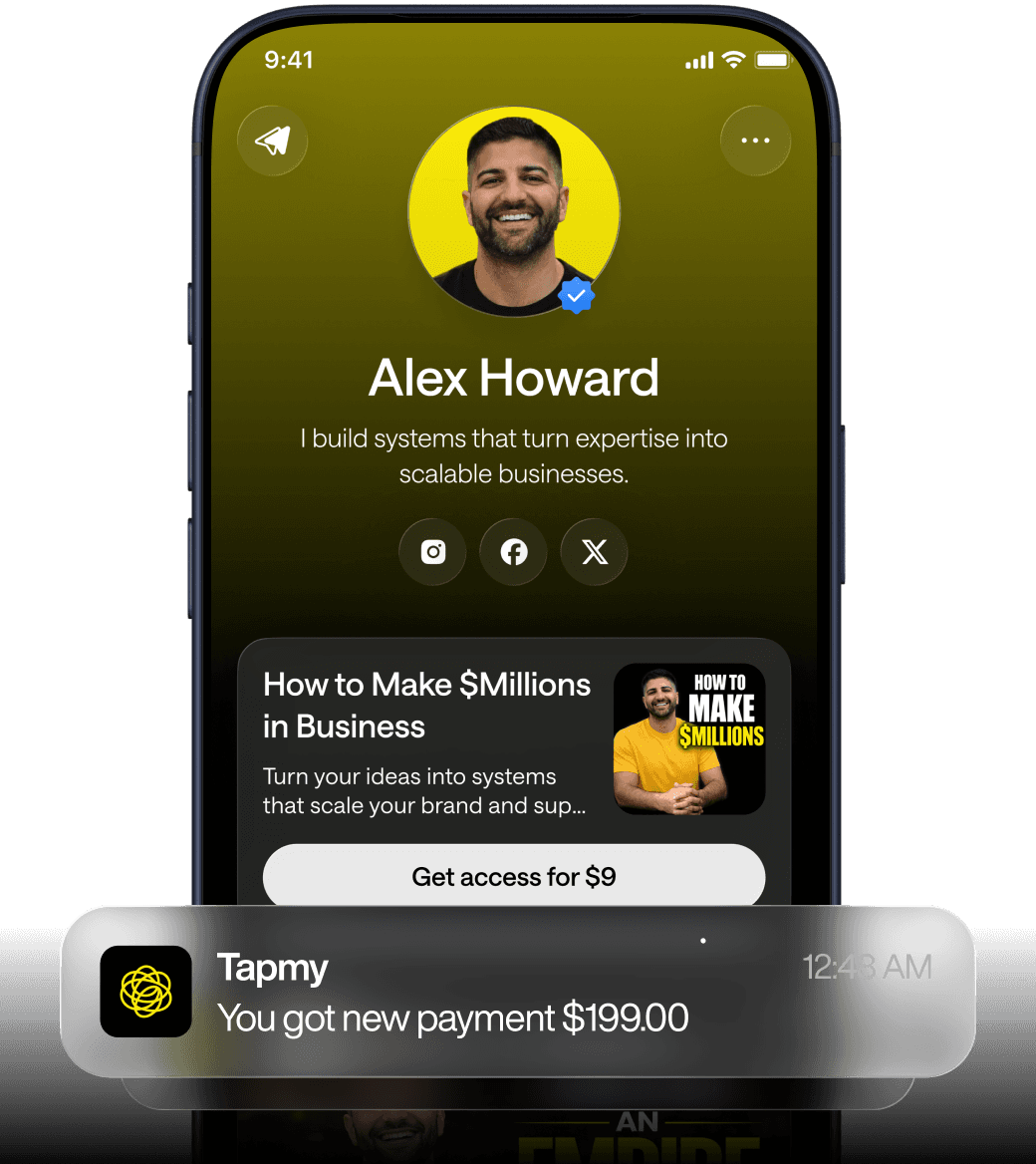
Tapmy’s perspective (Tapmy’s perspective is instructive) (framed as a monetization layer = attribution + offers + funnel logic + repeat revenue) is instructive here. If your link-in-bio page is part of a monetization layer, the featured offer becomes the funnel’s primary conversion point. Secondary links serve as fallback paths or nurture content. Tracking clicks without that hierarchy often yields noisy data—many clicks, little revenue clarity.
Visual tools amplify the hierarchy. A header image or short looping video that frames the page’s intent can reduce the perceived number of choices by creating a narrative anchor. For example, a video that shows a product in use clarifies what the top CTA is about before the user reads the links. That reduces scanning time and increases intent-aligned clicks.
There are trade-offs. A featured offer risks hiding long-tail opportunities. If you rely on diverse revenue streams, burying them may reduce incidental conversions that, in aggregate, matter. So the rule is not "always one link." The rule is "feature what aligns best with your primary goal, and make other options discoverable but lower friction to ignore."
Seasonal rotation and campaign-based link surgery: how to keep the page fresh without confusing repeat visitors
Link churn is a real operational problem. Replace links too aggressively and you break muscle memory for returning users. Replace them too rarely and you lose seasonal relevance. The compromise is conservative rotation guided by campaign windows and analytics.
Practical cadence: for major seasonal campaigns, adjust the featured offer and top two links. Leave the lower list intact. For weekly content drops (podcast episodes, blog posts), use a "recent" slot that rotates automatically without changing the core hierarchy.
Here’s a short table that codifies common approaches and their failure modes. It’s practical: useful for a creator in the middle of a launch or for someone worrying whether their "link in bio page structure" is flexible enough.
What creators try | What breaks | Why it breaks |
|---|---|---|
Swap every link for each campaign | Return visitors can’t find favorite resources | High cognitive cost for habitual users; loss of discoverability |
Add every new offer to the top | Top of page becomes a dumping ground | Visual priority loses meaning; CTAs compete |
Keep a static list forever | Seasonal offers get buried; engagement plateaus | Relevance declines over time; audience intent shifts with seasons |
Use a rotating "Recent" slot | Potentially lower discoverability for evergreen products | Rotation improves freshness but dilutes permanence |
Operationally, add a simple versioning practice: tag every change with a minified change note (date + reason) and keep a rolling log of the prior three states. It sounds bureaucratic, but it makes it easy to rollback if a new configuration performs worse. Also, keep a persistent link to a “full site” or archive so power users can find what they previously used (that’s a common pattern that reduces the cost of rotation).
(Aside: creators often underestimate the emotional effect of link changes. Fans build habits. When they can’t find a favorite because you swapped it for a sale, they notice—and sometimes respond negatively.)
Measuring impact: experiments, metrics, and common failure modes to watch for
Testing is the non-sexy, necessary work. You can’t "feel" your way to the right number of links — you have to experiment and measure. But experiments on link-in-bio pages have constraints: small sample sizes, traffic source heterogeneity, and platform tracking limitations.
Start with three cheap experiments that isolate the variable of link count:
1) Feature vs. flat list A/B: Run a split where one variant has a featured primary CTA and the other shows a flat list of the top five links. Measure conversion rate on the primary goal (purchase, booking, subscribe).
2) One removal sequential test: Take the existing page, remove a low-priority link, and observe change in aggregate conversion and in click distribution for two weeks. If total conversions rise or stay stable and click distribution consolidates to higher-value links, you’ve improved signal-to-noise.
3) Depth test: Keep the same number of links but change their placement (move secondary links behind a “More” expander). This measures the cost of visibility vs. the benefit of decluttering.
Metrics to track beyond raw clicks:
Conversion rate per landing flow: clicks → qualified conversion (purchase, signup, booking). Prioritize tracked revenue over click counts.
Scroll & attention metrics: heatmaps and scroll depth to gauge how far users go on different variants.
Time to click: how long before a visitor clicks—this reveals decision friction.
Return visitor behavior: does rotation confuse repeat users?
Be cautious with sample size and attribution. If your traffic is 500 visits/day, segmenting too many A/B variants will give you noisy results. Use sequential tests (change, observe, rollback) as a fallback when classic A/B isn’t feasible.
Platform constraints matter. Many link-in-bio providers allow only certain tracking parameters or restrict deep linking. If you can’t append UTM parameters or run sub-second redirects that preserve attribution, your click-to-revenue mapping will be incomplete. Those are the moments when a monetization layer — attribution + offers + funnel logic + repeat revenue — becomes valuable because it centralizes revenue signals rather than relying on link-by-link analytics that some platforms strip.
Common failure modes I’ve seen in real audits:
Fail: counting clicks as success. Clicks are a leading indicator, not the thing. A high-click page that produces zero revenue is a false positive.
Fail: overfitting to short-term campaigns. You optimize for the holiday push and delete evergreen conversion paths, then wonder why long-term revenue falls.
Fail: ignoring source context. The same link-in-bio configuration performs differently when traffic comes from an organic post vs. a paid ad. Segment before you judge.
Finally, here’s a compact table contrasting common assumptions with observed outcomes.
Assumption | Observed reality |
|---|---|
More links = more conversions | More links often increase clicks but dilute conversion rate; top CTA performance usually drops |
All links are equally valuable | Clicks concentrate on a few items; many links are attention-fillers with negligible downstream value |
Frequent rotation keeps things fresh | Rotation helps discoverability but can erode habitual conversions if core links vanish |
FAQ
How many links should I put in my link in bio if I sell both products and coaching?
It depends on primary goal prioritization. If immediate revenue from products is the top goal, feature a product prominently and place coaching as a secondary visible option (or behind a “services” link). Aim for 2–3 visible above the fold. If coaching is a higher-margin, longer-term play, invert that priority. The exact count matters less than the logical hierarchy tying each link to a measurable outcome.
Will removing links reduce long-tail income from rarely-clicked offers?
Possibly. Removing a link eliminates accidental or serendipitous clicks that can add up. Before deleting, check revenue attribution for those links. If they genuinely contribute, tuck them below the fold or into a "Resources" archive rather than deleting. That preserves the long tail while protecting your primary funnel.
How do I test different link counts with low traffic?
Use sequential tests: change the page and run the variant for a reasonable window (two to four weeks) while holding traffic sources constant. Look at conversion per visit rather than absolute conversions. Combine that with qualitative signals—short user interviews or simple on-page polls—to supplement sparse quantitative data.
Does a header image or video always improve conversion?
No. A header element that clarifies the page’s intent can reduce perceived choices and increase conversions, but a distracting or slow-loading video can hurt mobile metrics. Use short, optimized media that supports the featured offer. On low-bandwidth audiences, a static image with clear messaging often outperforms a heavy video.
How should I handle evergreen vs. campaign links to avoid confusing repeat visitors?
Keep a stable top hierarchy: 1–2 permanent primary links and 1 rotating slot for campaigns. Maintain an accessible archive link labeled clearly (“More” or “All resources”) for users seeking past items. This balances freshness with reliability and reduces the risk of alienating habitual visitors.


