


" height="21.95706114703747px" id="qM5sFNDIS" transform="translate(3.459 1.023)" width="17.081538493872166px"/></svg>)
" height="16.041644077985946px" id="vPwWmgEb7" transform="translate(2.375 4.207)" width="19.249983003077222px"/></svg>)
" width="20px"><path d="M 0 20 L 0 0 L 20 0 L 20 20 Z" fill="transparent" height="20px" id="Iu2kCeaUT" width="20px"/><path d="M 4.531 6.206 L 0.253 6.206 L 0.253 19.08 L 4.531 19.08 Z M 2.393 4.449 C 3.884 4.449 4.813 3.46 4.813 2.224 C 4.785 0.961 3.884 0 2.421 0 C 0.957 0 0 0.961 0 2.224 C 0 3.46 0.929 4.449 2.364 4.449 Z M 11.178 19.08 L 11.178 11.89 C 11.178 11.506 11.206 11.121 11.319 10.847 C 11.628 10.077 12.333 9.281 13.515 9.281 C 15.063 9.281 15.682 10.462 15.682 12.193 L 15.682 19.08 L 19.961 19.08 L 19.961 11.698 C 19.961 7.744 17.85 5.904 15.034 5.904 C 12.765 5.904 11.747 7.152 11.178 8.029 L 11.178 6.206 L 6.899 6.206 C 6.956 7.414 6.899 19.08 6.899 19.08 Z" fill="rgb(0, 0, 0)" height="19.079659942779543px" id="hzLTqQuQE" transform="translate(0.02 0.461)" width="19.960870207061767px"/></g></svg>)
" height="18px" id="TrPl6m2Z8" transform="translate(1.75 3)" width="20.5px"/></svg>)
Key Takeaways (TL;DR):
Prioritize Thumb-First Design: Use tap targets of at least 44x44 pixels with generous vertical spacing (12-20px) to prevent accidental clicks and user frustration.
Optimize for In-App Browsers: Test specifically for Instagram, TikTok, and Facebook browsers, which often block popups, certain APIs, and third-party cookies used in payment flows.
Maximize Load Speed: Every second of delay costs conversion; prioritize 'time-to-first-meaningful-paint' by inlining critical CSS and lazy-loading non-essential assets.
Reduce Payment Friction: Implement one-tap solutions like Apple Pay and Google Pay to eliminate manual form entry, which is a primary driver of checkout abandonment on mobile.
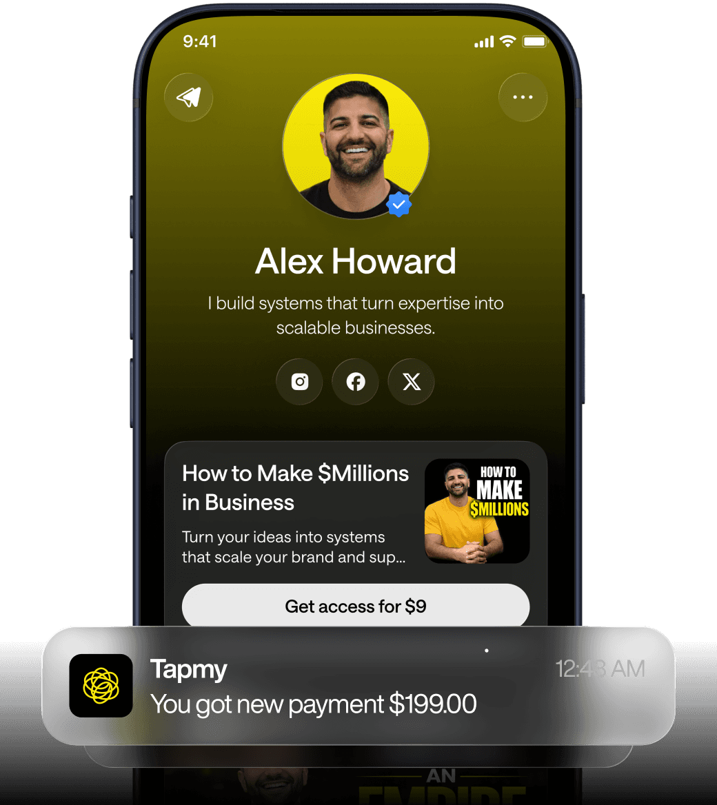
Strategic Content Hierarchy: Place the primary offer above the fold (within the first screenful) and use progressive disclosure for secondary links to keep the layout clean yet functional.
Mobile-first mismatch: why desktop-designed bio links lose revenue
Social analytics for creator accounts consistently show one simple fact: the audience is on phones. Platforms report 85–95% mobile share for core social feeds, and in many creator cases that number is closer to 90% or higher. When a creator or developer designs a bio link on a laptop—dragging buttons to look tidy in a 1200px viewport—they are optimizing for a context their users rarely occupy. The result isn’t just aesthetic friction; it manifests as measurable conversion loss.
Two conversion comparisons often circulate among growth teams: properly optimized mobile bio links convert in the 5–8% range, while pages conceived as desktop-first and merely scaled down to fit phones often land at 2–3% on mobile. Those figures reflect many interacting failures: mis-sized tap targets, long load times, awkward scrolling patterns, and modal flows that break inside in-app browsers. Fixing any single issue helps. Fixing the pattern—reorienting design assumptions—moves the needle materially.
Designers and engineers who don’t use the social apps where their audience lives make particular errors. They assume hover states, fine-grained typography, and side-by-side layouts will survive the translation to small screens. They do not test thumb reach, intermittent connectivity, or payment dialogs inside Instagram’s embedded browser. That’s where revenue leaks happen.
Quick note on framing: when evaluating monetization outcomes from bio links, treat the monetization layer as a combination of attribution + offers + funnel logic + repeat revenue. Any mobile design choice that interferes with one of those four components reduces the effective monetization rate, even if it looks polished on desktop.
Thumb-first layout: tap targets, spacing, and vertical flow for mobile bio link design
On mobile, the primary interaction is a thumb or finger. Thumb ergonomics and vertical scrolling define how people parse a bio link. A few rules are non-negotiable: tap targets should meet minimum size guidelines, vertical rhythm must match scrolling behavior, and content stacked vertically is faster than compressed multi-column designs.
Apple’s Human Interface Guidelines and Google’s Material Design independently recommend a 44×44 pixel minimum for touch targets. That figure isn’t arbitrary. It represents a practical balance between finger pad size and variance in hold posture. On phones with different pixel densities, the CSS size may differ, but in device-independent pixels the rule stands. Crucially, you must account for padding and margins—visible button size can meet 44×44 while its clickable hit area is smaller unless you explicitly set padding or use a touch-action friendly element.
Spacing matters as much as absolute size. When links are flush together, accidental taps spike and conversion drops because users back out or hesitate. A comfortable vertical rhythm of 12–20px between stacked CTAs is common, but better is to design blocks whose visual affordance matches their tappable area: big text, generous padding, and contrast that reads at arm’s length.
Above-the-fold on a phone is not a 1024×768 rectangle shrunk down. On most modern phones, “above the fold” is two to four thumb swipes worth of content unless the visitor lands from a deep link. Place the primary offer—what customers came for—within the first screenful. Secondary offers can live lower, but make the hierarchy explicit with size, contrast, and spacing.
Design Intent | Mobile Mis-translation | What breaks |
|---|---|---|
Compact horizontal button groups | Stacked vertically in narrow viewports | Important CTAs pushed below fold; accidental taps between tightly stacked items |
Small typography for aesthetic balance | Diminished legibility at arm's length | Higher abandonment; perceived trust decreases |
Hover-only affordances | No hover support on touch devices | Missing cues for interactivity; users tap blindly |
One practical pattern: treat each CTA as a full-width card with a clear affordance, at least 44px tall (tap target), and with 16–24px padding for comfortable fingers. The card should include a concise label, a supporting microcopy line if necessary, and an optional icon to increase hitability. Icons matter less for cognition than for creating a larger visible target.
Layout trade-offs are real. Full-width stacks use vertical real estate quickly, forcing deeper scrolls when the page has multiple offers. Yet the cost of additional scroll is usually lower than the cost of missed taps. Consider progressive disclosure—show one primary CTA prominently, then reveal additional links via a short, explicit “more” affordance that opens a lightweight modal or expands content inline. Progressive disclosure keeps the primary funnel shallow while still preserving secondary monetization paths.
Load speed behavior: what actually happens when a bio link hits a 3–5 second load time
Speed is rarely an aesthetic decision. It’s a behavioral lever. The conversion relationship with mobile load time is non-linear and asymmetrical. Small gains at the low-latency end matter disproportionately. The empirical figures often cited in mobile optimization conversations—1s load converts around 6.2%, 3s around 4.1%, 5s around 2.8%—capture this. They’re not universal law, but they reflect a consistent pattern: every additional second costs conversion, and the slope steepens beyond 3 seconds.
Why does speed hit conversions so hard on mobile? Three root causes interact. First, attention windows are shorter when people consume content in feeds; they’re interrupted more often. Second, perceived reliability falls with loading delays: if the page renders slowly, users suspect a broken link or an ad-trap. Third, technical friction—timeouts in in-app browsers, failed payment handoffs—actually abort transactions.
The most common load-time killers in bio link pages are third-party scripts, large images, and heavy CSS frameworks. Many builders copy patterns from marketing sites: hero images, animation libraries, analytic SDKs. On desktop these seem acceptable. On mobile they create cascading delays: DNS lookups, TLS handshakes, and large download sizes. Even a deferred script that fires after 1s can delay first paint on constrained devices because of main-thread contention.
Mitigation is pragmatic. Deliver critical CSS inline for the critical above-the-fold UI. Lazy-load images that are not immediately visible. Use responsive image formats (AVIF/WebP where supported) and set width/height attributes to avoid layout shifts. Prefer native browser features—prefers-color-scheme media queries, system fonts—to avoid loading remote font files. And, crucially, audit every third-party inclusion: analytic SDKs, tracking pixels, and A/B test libraries all add cost.
What people add | Perceived benefit | Real mobile cost |
|---|---|---|
Large hero images | Branding, visual appeal | Seconds of download; layout shift; lower conversions |
Multiple analytics SDKs | Data granularity | Increased initial page weight; blocking; privacy complications |
Custom fonts and icons | Consistent typography | Font download latency; FOIT/FOUT issues |
Speed optimization sometimes requires hard trade-offs. If a visual experiment uses a scripted carousel for multi-offer promotion but it adds 500–700ms to the first meaningful paint, test removing it. You might lose a marginal aesthetic win but retain a higher-converting, faster funnel. In short: prioritize first meaningful paint for the primary monetization path.
Mobile checkout and payments: reducing friction, supporting native methods, and avoiding modal failures
Checkout is where design and payment plumbing collide. On phones, traditional multi-field forms are conversion killers. Users often have autofill disabled for privacy, keyboards obscure inputs, and modal permissions (for camera, notifications) interrupt flow. Successful mobile bio link design minimizes fields and leans into payments methods that remove typing entirely.
Apple Pay and Google Pay offer the one-tap shorthand that mobile users prefer. In practice, these methods reduce perceived friction because they use stored credentials and device-level authentication (Touch ID, Face ID, or passcode). As a result, conversion rates rise and checkout abandonment drops. Implementing them, however, requires server-side support for tokenized flows, proper SSL configuration, and compliance with card payment rules. It also requires UI fallbacks for devices that don’t support these methods.
Form reduction guidelines:
Only collect what you need to fulfill the purchase.
Prefer guest flows over forced account creation; ask for account creation later.
Use auto-detect for country, region, and phone formatting when possible.
Offer progressive shipping cost previews rather than hiding fees until the last step.
Beyond field count, watch how payment dialogs behave inside in-app browsers (Instagram, TikTok, Facebook). Those environments sometimes limit payment APIs or block cross-site cookies used to maintain session state. A frequent failure pattern: a user initiates a third-party payment widget that opens a new window or relies on popups; in-app browsers suppress the popup or sandbox the window, causing the flow to die. The page appears to hang or redirect to a blank white page.
Two defensive patterns reduce these failures. First, prefer in-page, redirectless payment flows when available—host the elements inline and avoid full-window redirects. Second, detect in-app browsers onload and present a granular instruction or alternative. For example, if the browser blocks a required feature, offer a lightweight fallback form or a payment link that opens in the system browser (with a short explanatory message). Friction here kills revenue; so does a confusing error message.
One more subtlety: privacy and permission behavior differs by platform. iOS handles cross-site tracking restrictions more aggressively in recent versions; cookies and local storage used for session continuity can be scrubbed when users switch back and forth from the social app. Design stateful checkouts to tolerate short-lived session loss: auto-save progress server-side and reconfirm user selections when possible.
Testing and platform constraints: iOS vs Android, in-app browsers, and the responsive vs mobile-specific decision
Testing on emulators is useful early, but it does not reveal many real failures. Device variation, network characteristics, and in-app browser quirks matter. The two dominant axes to test are platform-parity (iOS vs Android) and browsing context (standalone Safari/Chrome vs Instagram/TikTok embedded browsers).
iOS and Android differ in keyboard behavior, input accessory bars, safe-area insets (notches), and payment dialog capabilities. For example, Apple Pay is pervasive on iPhones but absent on most Android devices unless Google Pay is supported and configured. Android devices show more variance in viewport size and pixel density; iOS devices have more consistent rendering due to tighter hardware controls. Both platform differences can be material for layout and payment UX.
In-app browsers are the most common source of failure. Instagram's internal browser historically lacks support for certain modern web APIs — service workers, some payment request APIs, and particular viewport meta behaviors. TikTok and Facebook maintain their own embedded browsers with differing user agent strings and different handling of popups and cookie policy enforcement. The result: scripts that work fine in standalone Chrome or Safari will sometimes fail silently in an embedded view. Verify flows inside Instagram and TikTok as part of device testing.
Responsive design versus dedicated mobile experiences is a decision with trade-offs. Responsive pages scale to many viewports and simplify maintenance. Dedicated mobile experiences (separate templates, server-side device detection, or progressive enhancement toggles) allow you to tailor interactions more aggressively—different markup, different asset sets, different payment flows. Which to choose depends on complexity and traffic volume.
Consideration | Responsive single template | Mobile-specific experience |
|---|---|---|
Development cost | Lower: one code path | Higher: separate templates or server logic |
Optimization granularity | Moderate: CSS/JS tweaks | High: can change markup, assets, and flows |
Testing surface | Smaller, but device quirks still present | Larger; must test both experiences |
Fallback management | Simper to maintain | Customizable per platform (e.g., remove carousel for in-app browsers) |
For most creators with high mobile traffic and limited engineering resources, a pragmatic approach is to implement a responsive base and then create targeted server-side or client-side feature flags for platform-specific fixes. For instance, detect Instagram’s in-app browser and load a streamlined asset set with the payment fallback already wired. That hybrid reduces maintenance overhead while allowing surgical optimizations where they matter.
Real-world testing checklist (partial):
Test on physical low-end Android and mid-range iPhone models, not just the newest devices.
Simulate poor networks (3G and high-latency LTE) and repeatable packet loss.
Verify payment flows inside Instagram, TikTok, and Facebook embedded browsers.
Track first meaningful paint and time-to-interactive on real devices using real user monitoring (RUM).
Failure modes you will see—and how to reason about root causes
Failures cluster. When you read analytics and see a high bounce rate from mobile but healthy desktop retention, do not start by rewriting copy. Look for correlated signals: time-to-first-paint, error logs from payment providers, percentage of sessions initiated within in-app browsers. Those signals tell you whether the issue is perceptual (slow, confusing UI) or technical (blocked APIs, failing redirects).
Below are common failure patterns and their root causes.
Observed symptom | Likely root cause | Immediate diagnostic |
|---|---|---|
High abandonment after tapping CTA | Delayed or failed navigation due to heavy scripts or blocked popups | Record network waterfall on affected devices and browsers |
Successful adds to cart but no completed payments | Payment API failure or session loss in in-app browser | Inspect server logs for abandoned payment intents and UA strings |
Users complain checkout fields reappear or reset | Local session storage cleared, or form state only client-side | Attempt reload and test session persistence across app-to-system browser handoffs |
Invisible CTAs on certain phones | Safe area insets or CSS not accounting for notches | Test on devices with notch and examine computed CSS on top/bottom elements |
Diagnosing is rarely binary. For example, a slow initial load might be due to an unoptimized image and also to a blocking analytics SDK. Removing the image may speed things but still leave a subtle delay. One pragmatic sequence: (1) strip non-essential assets and measure improvement; (2) isolate third-party scripts and load them asynchronously or defer; (3) reintroduce critical assets gradually while monitoring real user metrics. It’s noisy, but it surfaces which change yields the biggest lift.
Expect surprises in the data. Conversion uplift after a performance fix may lag because marketing channels adapt (ad networks sometimes throttle traffic to “optimal” experiences). Also, A/B testing on mobile is noisier due to session instability. Use multiple signals—RUM metrics, server-side success rates, and qualitative user reports—before committing to major redesigns.
Practical checklist to optimize bio link mobile design (developer + creator handoff)
Here’s a practical checklist to guide a focused optimization sprint where the designer and developer must collaborate quickly.
Area | Concrete action | Why it matters |
|---|---|---|
Tap targets | Ensure buttons/links >=44×44 px and increase padding | Reduces accidental taps; increases conversion |
Primary CTA placement | Put single main offer within first screenful | Higher likelihood of immediate clicks |
Speed | Inline critical CSS; lazy-load images; remove unused JS | Improves first meaningful paint and conversion |
Payments | Enable Apple Pay / Google Pay; implement server-side tokens | Reduces typing; increases completed payments |
In-app browser handling | Detect and load a streamlined bundle with fallbacks | Avoids blocked APIs and popup failures |
Testing | Test on physical devices across OS versions and embedded browsers | Identifies platform-specific breaks not visible in emulators |
Handing these tasks off: designers should provide explicit mobile-first components (full-width CTA cards, scalable icons, spacing tokens). Developers should provide a build process that outputs a performance budget and enforces it. Both parties must agree on acceptable fallbacks for unsupported features rather than assuming they’ll “fix it later.” For more resources on templates and rapid implementation, see the templates and the guide on setting up your bio link.
FAQ
How do I prioritize changes when my bio link has many issues?
Start with actions that affect the primary conversion path: reduce load time for the first meaningful paint, make the main CTA immediately tappable, and ensure payments work in the most common browsing contexts. Use a simple metric—completed purchases per unique visitor—to judge impact. If you can only change three things in a sprint, choose tap target sizing, asset slimming (images/fonts/scripts), and a payment fallback for in-app browsers. For quick, actionable fixes, check our quick wins checklist.
Should I build a fully separate mobile site for bio links or rely on responsive design?
Most creators benefit from a responsive base plus tactical platform-specific overrides. A separate mobile site gives maximum control but increases maintenance. If your traffic is overwhelmingly mobile and you need specialized payment integrations or radically different UI flows for in-app browsers, a mobile-specific path can pay off. Otherwise, responsive with feature flags for targeted optimizations is a cost-effective compromise. For scaling advice, see scaling bio link revenue.
Why do payment flows fail inside Instagram or TikTok browsers, and can I reliably detect that?
Embedded browsers often restrict popups, block some modern web APIs, and implement stricter cookie handling. Payments commonly fail when a widget relies on a popup or cross-origin storage. You can detect these browsers via user-agent sniffing or runtime checks (e.g., whether window.open behaves normally), and offer an explicit fallback: either a simplified in-page flow or a message prompting users to open the link in their system browser. Neither approach is perfect; the fallback reduces, rather than eliminates, checkout failure. If you're building systems to automate revenue, read about automated bio link revenue.
How much do images and fonts really impact mobile conversions?
Images and fonts can be the single largest contributors to initial page weight and layout shifts. Large hero images add seconds and change perceived load speed; custom fonts trigger FOIT/FOUT behaviors that impair readability. Replacing heavy assets with optimized formats, system fonts, or locally cached assets typically yields measurable improvements in first paint and abandonment rates. The pragmatic approach is to measure real user metrics before and after changes—don’t assume savings translate directly to revenue without testing. For measurement techniques, see how to measure and improve performance.
Is it worth implementing Apple Pay and Google Pay if my audience spans many countries?
Yes, but with caveats. Native payment methods significantly reduce friction where supported; however, they won’t cover every market. Implement them as high-priority options for the platforms that support them, and maintain robust fallbacks (card input or localized third-party payments) for other regions. Also ensure your back-end can handle tokenization and failure recovery, because partial payment support without reliable fallbacks creates inconsistent experiences and can lower trust. If you need a full-stack toolset to support these flows, review the top tools and platforms for link-in-bio optimization.