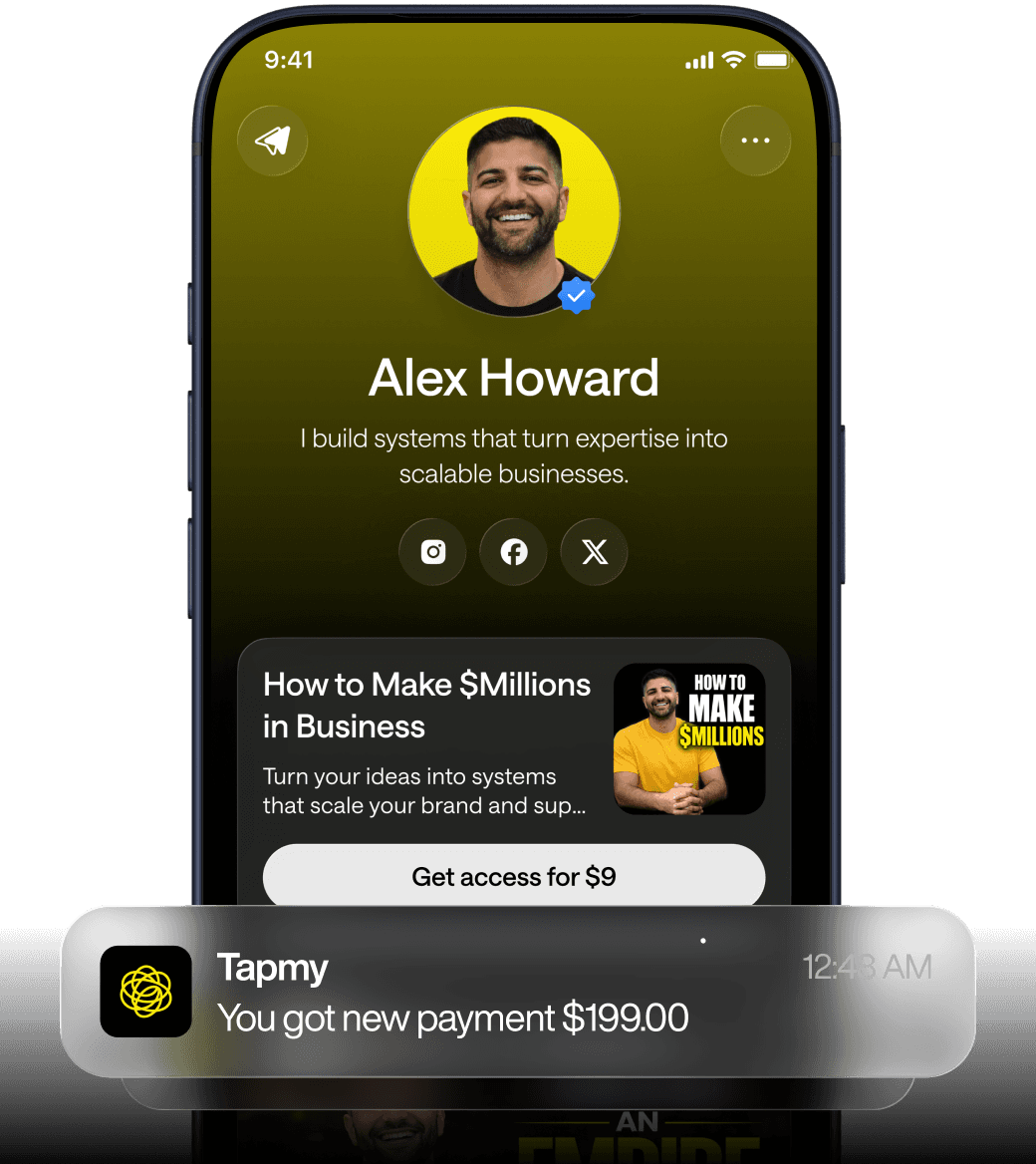
Key Takeaways (TL;DR):
Reduce Choice Overload: Limit bio link offers to 3–5 strategic options to decrease decision friction and concentrate visitor attention on high-ROI actions.
Implement Short-Term Urgency: Use 24–48 hour promotion windows with visible countdown timers to match the fast-paced consumption habits of social media users.
Optimize Top-Fold UX: Ensure the primary CTA is visually distinct, supported by adjacent social proof, and features large, thumb-friendly tap targets for mobile devices.
Capture Data Early: Use lightweight, single-field email capture flows before redirecting to external sites to build long-term audience value and enable retargeting.
Perform Regular Maintenance: Conduct weekly audits to remove broken links and outdated promotions, as these errors significantly damage credibility and leak revenue.
Follow a Priority Matrix: Focus on 'quick wins' like matching your profile bio text to your primary link offer and reducing clutter before investing in complex technical integrations.
Cut choices: why reducing offers to 3–5 lifts conversions quickly
Too many creators assume that more choices mean more chances to convert. Empirically, the opposite often happens on bio link pages. When users land on a compact mobile screen, cognitive load and short attention windows make choice architecture crucial. Reducing visible offers from eight or more down to three-to-five strategic options tends to concentrate attention, reduce decision friction, and improve click-to-conversion ratios.
Mechanically, fewer options change two things at once. First, the visual hierarchy becomes stronger: a headline, a A/B testing signal, and two or three supporting offers occupy the prime real estate above the fold. Second, each offer can be framed with clearer social proof and a tighter value proposition. Those are surface observations. The deeper reason this works is about context collapse: visitors to a bio link arrive from different intents—discovery, shopping, support, or curiosity. Too many offers force a split of intent signals, which in turn dilutes any A/B testing signal and confuses downstream attribution.
Why three-to-five? The range is pragmatic. Three keeps the top fold uncluttered. Five allows for a primary product, a secondary low-friction offer (like a freebie or inexpensive product), an email capture, a social proof link (testimonials), and a one-click donation or booking. Pick fewer if your funnel relies on a single hero product; pick closer to five when you must serve a few distinct audience segments.
What breaks in practice. Two patterns reappear in audits. First, creators fold every revenue stream into the bio link: merch, affiliate links, coaching, donation, newsletter, partner promos—eight to twelve tiles. Result: no clear CTA, poor attribution, multiple micro-bounces. Second, teams try trimming offers but do it by removing the wrong items—often the lowest-visibility or newest offers. That preserves complexity and kills potential winners.
Operational steps that work faster than redesign:
1) Map your revenue funnel top to bottom. Identify which one or two offers are historically responsible for the majority of revenue from social channels. If you can't access good data, prioritize the most recent promotions or highest-margin items.
2) Lock a primary CTA. Make it visually distinct. On mobile, use size, contrast, and microcopy to reduce ambiguity.
3) Replace low-performing items with a single catchall: "More" or an expandable menu that doesn't occupy the above-fold area. If your bio link tool lacks conditional visibility (many do), use a single link to a mini landing page that houses the rest.
Trade-offs. Less is not always more when the wrong choices are removed. If you reduce to three offers but those are all niche products, you narrow reach. Also, creators who rely on discovery algorithms (e.g., platform-specific link cards) may see less traffic to secondary channels. Expect short-term dips in click volume if traffic sources were previously guided to niche offers. But conversion rates should improve if the primary offers match visitor intent.
Practical note: on small screens, tap targets matter. Reducing options is necessary but not sufficient; ensure remaining buttons are spaced and sized for contact accuracy. Otherwise you trade fewer options for accidental taps and higher bounce rates.
Urgency that converts: practical 24–48 hour promotion patterns and common failure modes
Urgency is a behavioral nudge, not a miracle. Short windows—24 to 48 hours—create a legitimate scarcity signal without appearing manipulative on social platforms. The mechanics: a visible countdown reduces procrastination, aligns with the quick-consumption behavior of social traffic, and syncs with platform posting cycles. Because social posts have short half-lives, a 48-hour promotion captures people still checking past posts and draws repeat attention.
Why the 24–48 hour band specifically? Longer windows dilute the signal (it feels like a normal sale), and shorter windows miss a meaningful portion of the audience that checks in infrequently. For creators who post episodically, a 48-hour window matches the common cadence—two days is enough for a post to get redistributed via saves and shares, yet short enough to provoke action.
Implementation variants that are low friction:
- A time-limited discount code visible on the primary CTA with a countdown timer next to it. The code text should be short; treat the timer as the dominant visual cue.
- A "last chance" banner above the primary CTA that appears only when the timer reaches the last 12 hours (requires conditional visibility).
Failure modes to watch for. Two practical issues come up repeatedly.
False urgency: If you run 24–48 hour promotions weekly, urgency becomes wallpaper. Visitors learn to wait for the next "short" sale. The trust cost grows.
Technical mismatch: Countdown timers that rely on JavaScript and are not server-synced show different remaining times across devices or break entirely on slow connections. The result is inconsistency: some visitors see expired promotions; others see infinite timers. That destroys payoff and harms credibility.
Also, exaggerated claims ("only 1 left") are easy to verify and can be reported as deceptive. For creators who sell limited-stock goods, reflect inventory truthfully or simply use time-limited discounts rather than fake scarcity.
How to test without building complex infra. Use time-bound offer tiles that replace the primary CTA when active. If your tool doesn't support dynamic replacement, schedule manual swaps—post at midday, swap the link, then revert. It costs time but avoids broken widgets. Realize that manual swaps scale poorly; if you find yourself doing this every week, it's a sign to invest in automation or a tool that supports timed promotions.
Capture before you send: email capture flows that don't kill conversion
Capturing an email capture before redirecting a visitor externally is a classic funnel improvement. It hedges against lost traffic and enables follow-up monetization. But poorly implemented email capture increases friction and reduces click-through. The aim is to preserve the conversion momentum while capturing a contact.
Two flow archetypes work in practice.
Light capture: a single-field email popup or an inline capture that appears when the user taps a CTA that would normally open an external link. The user enters email, the external link opens. This preserves the intent to leave while adding a small cognitive step.
Progressive capture: capture on second engagement. Let the first click be frictionless; if the same user returns or engages again, prompt for email. This reduces first-click abandonment but depends on the platform's ability to recognize repeat visitors (cookies or local storage). Not all bio link tools support that.
Why some capture flows fail. Four root causes:
1) Timing mismatch: requesting email before the user knows the value is asking too early. If a click targets a product, users expect to land on the product page; intercepting that flow is jarring.
2) Poor mobile UX: popups that cover the entire viewport and require precise tap actions create accidental dismissals. On phones, even a small scroll can dismiss the overlay.
3) Tracking conflicts: email capture tools that reload the page or create cross-domain redirects can break utm or referrer-based attribution, muddying the data.
4) Consent and compliance: global privacy rules require clarity around marketing consent. A checkbox pre-selected for promotional emails is risky and, besides legal issues, harms trust.
Best practices that practitioners use:
- Keep captures single-field. Email only. Reduce typing friction.
- Use microcopy that states benefit. "Get the discount code + 2 exclusive tips" is better than "Sign up".
- Open external links after the capture completes. Ideally, open in a new tab so the bio link stays accessible if the external page fails to load.
- If you must redirect immediately, save the email asynchronously and fire the redirect only after a small, imperceptible confirmation (200–500 ms). That preserves perceived speed.
Where platform limits bite. Many bio link tools either lack asynchronous capture hooks or require custom scripts to open external links after a capture. If the tool forces a full-page redirect to collect email, conversion drops. Which brings us back to the monetization layer idea: capture sits at the intersection of attribution, offers, funnel logic, and repeat revenue. If the tool doesn't allow you to sequence those elements, you're stuck with trade-offs.
Triage: optimizing the top fold — CTA hierarchy, social proof, and mobile tap targets
Top-fold triage is where small changes yield immediate impact. While multiple elements matter, three interact non-linearly: a clear primary CTA, visible social proof adjacent to that CTA, and tap-target sizing for mobile. Fix two and ignore the third at your peril.
Primary CTA hierarchy. The primary CTA must reflect the highest-ROI action and be unmistakable. That means not only label copy but also contrast, position, and text length. Labels like "Book a Call" or "Start the Course" are better than "Learn More". The latter creates uncertainty about next steps. Pair that label with context: price, timing, or discount—short context helps.
Social proof placed correctly. Testimonials and social proof should support the CTA, not distract. Short, scannable proof points—one-sentence quotes, star ratings, or a single line showing recent purchases—work best when placed immediately below or beside the CTA. Long testimonials are fine elsewhere, but they do not belong in the top 50 pixels of the mobile viewport where they push the CTA off-screen.
Tap targets and load speed. On phones, buttons should follow Apple's HIG and Android guidelines: aim for a 44–48 pixel height at minimum, with sufficient spacing. Small, crowded buttons generate accidental taps and raise bounce. Relatedly, page load speed is a silent killer. Heavy social proof widgets (video embeds, animated carousels) can delay time-to-interaction. Trade heavy persuasion assets for simple, fast elements above the fold.
Why this combination matters. Humans don't rationally evaluate a page. They glance, find a hook, and decide to tap. If the hook is ambiguous, the next step is either to scroll (and maybe convert) or to bounce. The hierarchy increases the probability of a direct path to conversion—click, capture, convert.
Practical quick checks (under five minutes):
- Shrink headline text to create room for the CTA. Many themes default to large fonts that push buttons below the fold.
- Replace long-form social proof near the CTA with one-line endorsements and, optionally, a micro-figure (e.g., "1.2k customers").
- Test button spacing with a simple screenshot of your page on your phone; tap with your thumb. If you mis-tap, adjust.
One practical aside: if you depend on affiliate links that require a redirect flow, ensure your email capture and pixel firing occur before the affiliate redirect. Otherwise the affiliate domain swallows the referrer, and attribution breaks. It's a small technical detail but explains a lot of puzzling revenue gaps.
When you need a lightweight reference for layouts, map the top fold to a single, clear landing page and a concise supporting line of social proof; that structure covers 80% of high-converting cases.
Rescue and recover: exit-intent, retargeting pixels, and cleaning broken links
Lost traffic is recoverable, but only if you build the right hooks before the loss occurs. Three rescue mechanisms usually provide the best marginal return: exit-intent popups, retargeting pixels, and the mundane but critical act of removing broken links and outdated promotions.
Exit-intent popups. On desktop, exit-intent (mouse movement toward the address bar) signals intent to leave. On mobile, true exit-intent detection is harder; most tools approximate with scroll thresholds or delayed overlays. Effective messages on exit include a last-moment discount, a free resource, or an email capture with a single-sentence value prop. The popup must be frictionless—single-field capture or a single-click discount reveal. Anything requiring multiple fields kills conversion.
Retargeting pixels. Placing retargeting pixels on the bio link page preserves the ability to re-engage visitors across platforms. A small tag allows you to create custom audiences of people who clicked the main CTA but didn't convert. The limitation: some bio link tools block custom scripts or limit pixel placement to a single container. That prevents granular audience building. Also, privacy changes (platform cookie policies) reduce pixel reach, so don't rely solely on pixel-based retargeting.
Broken links and outdated promotions. This isn't glamorous, but it moves the needle fast. Outdated promo tiles or broken links create a credibility gap and leak potential revenue. A single broken checkout link can cost hundreds or thousands in a week for high-traffic creators. Regular audits—weekly or biweekly—catch these. If you can't do frequent audits, automate link health checks with a simple monitoring script or use a tool that reports link failures.
Common failure patterns:
- Exit intent used as a band-aid for poor page design. If your page lacks a clear CTA, the popup will at best salvage a fraction of exits. Fix the primary flow first.
- Pixels fire on the wrong pages. Some creators place a purchase pixel on the landing bio link page and then remarket incorrectly, inflating expected attribution. Map your pixels to real events and test with browser developer tools.
- Overuse of popups. Three overlays in a single session will lead users to ignore them and can trigger ad-blockers or intrusive behaviour flags on some platforms.
If you run a small team, assign a weekly link audit to one person — the labor cost is low and the uplift from removing outdated promos or fixing a dead checkout is often immediate for teams managing multiple campaigns.
Implementation matrix and real-world case patterns
Practitioners with limited time need a prioritization framework. Below is an implementation time vs impact matrix. It helps decide which quick win to run first based on available time and expected payoff.
Quick Win | Estimated Implementation Time (minutes) | Expected Immediate Impact | Why it moves the needle |
|---|---|---|---|
Reduce offers to 3–5 | 20–60 | High (conversion concentration) | Reduces choice overload and clarifies primary CTA |
Add 24–48h urgency | 10–40 | Medium–High (depends on novelty) | Triggers action aligned with social traffic lifecycle |
Email capture before redirect | 15–90 (depends on tool) | High (long-term value) | Preserves contact for follow-up; increases LTV |
Top-fold social proof + CTA tweak | 15–45 | Medium | Improves trust at critical moment; reduces mis-clicks |
Optimize tap targets and speed | 20–120 | Medium | Reduces accidental taps; improves perceived performance |
Exit-intent popup | 10–30 | Low–Medium | Captures marginal converts on exit |
Retargeting pixel | 10–60 | Low–Medium (longer-term) | Enables follow-up ads; recovers lost users |
Update bio CTA to match primary offer | 5–15 | Medium | Reduces intent mismatch; clarifies next step |
Remove broken links and outdated promos | 10–40 | Medium–High | Restores credibility; prevents revenue leakage |
Use the matrix to form "work blocks." If you have 90 minutes, the highest ROI combination is often: reduce offers (30 min), top-fold social proof + CTA tweak (30 min), and update bio CTA (10 min). That leaves time for a quick link audit. Those three moves alone shift the signal dramatically.
To bring this to life, here's a compact case pattern observed across several creators.
Case pattern: Creator A (90-minute sprint)
They removed five low-activity tiles, locked a single primary CTA linking to a landing page for a current course, added a visible one-line testimonial below the CTA, swapped the bio CTA in their social profile to match the course, and introduced a 48-hour discount banner on the landing page. Implementation required no developer help—just the bio link tool editor and a short landing page tweak. Outcome: a ~35% jump in revenue over the following week and a 22% uplift in email captures (reported by the creator). The key point: the creator focused on alignment—profile CTA, bio link CTA, and primary landing offer all said the same thing.
Constraints and platform limitations that block similar work. Not all bio link tools allow conditional tiles, scheduled timers, or embedded pixels. Some tools force external links to open in the same tab, making it impossible to capture email without breaking flow. Others lack customizable button sizing or limit visual contrast choices. When the tool won't let you do a basic sequence (capture → open external link), the common workaround is to use a micro landing page as an intermediate. That reduces friction at the expense of one extra click. It works, but it reduces conversion potential slightly.
Decision matrix for constrained environments. Use the second table to decide the right path when your tool limits you:
Constraint | Fast workaround | Cost (time/user friction) | When to prioritize |
|---|---|---|---|
No conditional visibility or scheduled timers | Manual swap of primary CTA & banner at set times | Moderate (manual labor) | When promotions are infrequent (monthly) |
No pixel or script support | Use UTM-coded links + landing pages to reconstruct audiences | Low–Moderate (tracking complexity) | Short-term until pixel support is available |
Cannot capture email asynchronously | Use a lightweight landing page with a single-field capture | Low (additional click friction) | When email capture is mission-critical |
Limited button styling/tap target control | Increase spacing via text reduction and smaller headlines | Low (design compromise) | Always—tap targets matter on mobile |
One practical aside: if you depend on affiliate links that require a redirect flow, ensure your email capture and pixel firing occur before the affiliate redirect. Otherwise the affiliate domain swallows the referrer, and attribution breaks. It's a small technical detail but explains a lot of puzzling revenue gaps.
Applying the Tapmy lens. Conceptually, these quick wins are elements of the monetization layer: attribution + offers + funnel logic + repeat revenue. The reason many creators can't execute all ten quick wins in under an hour is not lack of will but tooling gaps. Some platforms don't let you toggle email capture inline, schedule timers, or insert pixels without code. A subset of new tools expose these controls as toggles and templates, making the sequence practical without engineering. That's a legitimate difference between "theory" and "what you can ship in an hour."
FAQ
How long should I run a 24–48 hour promotion before I call it successful or not?
Evaluate short-term metrics within 48–96 hours. Look at visits, click-through to the primary CTA, email captures, and purchases. Conversion windows vary by product type: digital goods often convert faster than high-touch services. If you see no uplift in CTR or email capture within the window and the landing experience is sound, the promotion likely failed in messaging rather than timing. Consider adjusting copy and social proof before concluding the timing was at fault.
Will reducing offers cannibalize long-tail revenue from niche products?
Possibly. If niche products depend on discoverability within the bio link, removing them will decrease exposure. The trade-off is clearer: higher conversion on a few offers versus lower visibility for many. A mitigation is to centralize niche items behind a single "More" link or a micro landing page. That preserves discoverability without cluttering the top fold.
Are exit-intent popups effective on mobile, or are they mostly desktop tools?
True exit-intent signals are harder to detect on mobile. Mobile approximations—delayed overlays, scroll thresholds, or inactivity timers—can work but are noisier. Use mobile-specific messaging and single-action interactions (e.g., a coupon reveal) to avoid friction. If your analytics show high mobile traffic, prioritize asynchronous recovery methods like pixel-based retargeting and email capture on the first engagement.
How do I prioritize quick wins when my bio link tool lacks scripting or pixel support?
Start with changes that require only content edits: reduce visible offers, update the bio CTA to match the primary offer, add a clear testimonial near the CTA, and remove broken links. Those moves cost only minutes and often provide the biggest immediate lift. For email capture or urgency mechanics, use a micro landing page as an intermediate step—it's slightly higher friction but bypasses tool limitations. Reserve manual scheduling for occasional promotions until you can move to a tool that supports automation if needed.


