


" height="21.95706114703747px" id="qM5sFNDIS" transform="translate(3.459 1.023)" width="17.081538493872166px"/></svg>)
" height="16.041644077985946px" id="vPwWmgEb7" transform="translate(2.375 4.207)" width="19.249983003077222px"/></svg>)
" width="20px"><path d="M 0 20 L 0 0 L 20 0 L 20 20 Z" fill="transparent" height="20px" id="Iu2kCeaUT" width="20px"/><path d="M 4.531 6.206 L 0.253 6.206 L 0.253 19.08 L 4.531 19.08 Z M 2.393 4.449 C 3.884 4.449 4.813 3.46 4.813 2.224 C 4.785 0.961 3.884 0 2.421 0 C 0.957 0 0 0.961 0 2.224 C 0 3.46 0.929 4.449 2.364 4.449 Z M 11.178 19.08 L 11.178 11.89 C 11.178 11.506 11.206 11.121 11.319 10.847 C 11.628 10.077 12.333 9.281 13.515 9.281 C 15.063 9.281 15.682 10.462 15.682 12.193 L 15.682 19.08 L 19.961 19.08 L 19.961 11.698 C 19.961 7.744 17.85 5.904 15.034 5.904 C 12.765 5.904 11.747 7.152 11.178 8.029 L 11.178 6.206 L 6.899 6.206 C 6.956 7.414 6.899 19.08 6.899 19.08 Z" fill="rgb(0, 0, 0)" height="19.079659942779543px" id="hzLTqQuQE" transform="translate(0.02 0.461)" width="19.960870207061767px"/></g></svg>)
" height="18px" id="TrPl6m2Z8" transform="translate(1.75 3)" width="20.5px"/></svg>)
Key Takeaways (TL;DR):
Prioritize the Thumb-Zone: Place high-value CTAs in the lower third of the mobile screen where they are easiest to reach during one-handed use.
Optimize for Speed: Aim for a load time under 3 seconds on cellular networks, as every extra second can reduce conversions by approximately 7%.
Standardize Tap Targets: Ensure buttons are at least 44–48 pixels wide with 12–16px of whitespace to prevent accidental clicks and user frustration.
Streamline Checkout: Reduce friction by minimizing form fields, using appropriate keyboard types (email vs. numeric), and offering guest checkout options.
Audit Performance: Use tools like Lighthouse for technical metrics and 'real-world' manual tests to check for horizontal scrolling or text that requires pinching to read.
Why desktop-first bio link templates fail the 90% of visitors on mobile
Most creators notice a familiar pattern: lots of profile views, almost no downstream clicks. The hard truth is that the underlying page frequently assumes desktop behavior and then “adapts” to a phone with CSS scaling and reduced font sizes. That adaptation is not a neutral failure — it actively creates friction. Visitors don’t just leave because the site looks different; they leave because the interactions they expect are gone.
At root, the problem is a mismatch between assumptions. Desktop-first templates assume wide viewports, cursor input, hover affordances, and multi-column layouts. Mobile users bring one-handed taps, limited bandwidth, and an expectation of rapid, linear scanning. When those expectations aren’t met, several failure modes appear simultaneously: tiny tap targets, confusing visual hierarchy, horizontal scroll, and slow first contentful paint. Each alone can suppress conversions; together they compound the loss.
Below is a practical mapping of common developer or designer assumptions to the real outcomes you see on phones. This table helps shift the conversation from "needs styling" to "broken interaction".
What teams assume | What actually happens on phones | Why it matters for mobile bio link optimization |
|---|---|---|
Grid and multi-column layouts are fine; they'll collapse via media queries | Columns collapse awkwardly, leaving cramped elements and small tap targets | Visitors must tap precisely; cramped elements increase missed taps and bounce |
Hover states provide affordance and microcopy reveals on desktop | Hover cues disappear on touch devices, and microcopy becomes hidden | Users lose explanations for buttons and links; they hesitate or leave |
High-res hero images add polish | Large payload increases load time on cellular networks | Every second of delay reduces conversion; long loads increase abandonment |
Modal pop-ups and interstitials work for CTAs | Pop-ups obstruct content, create scroll jumps, and often trigger accidental taps | Interruptions during a short mobile session are conversion killers |
Think of the template as a hypothesis: "compressing layout and reducing sizes will preserve the design." On mobile, that hypothesis is usually false. The consequences are practical: users can’t reach the primary CTA with their thumb, they must pinch to read, and they abandon before the page registers an interaction.
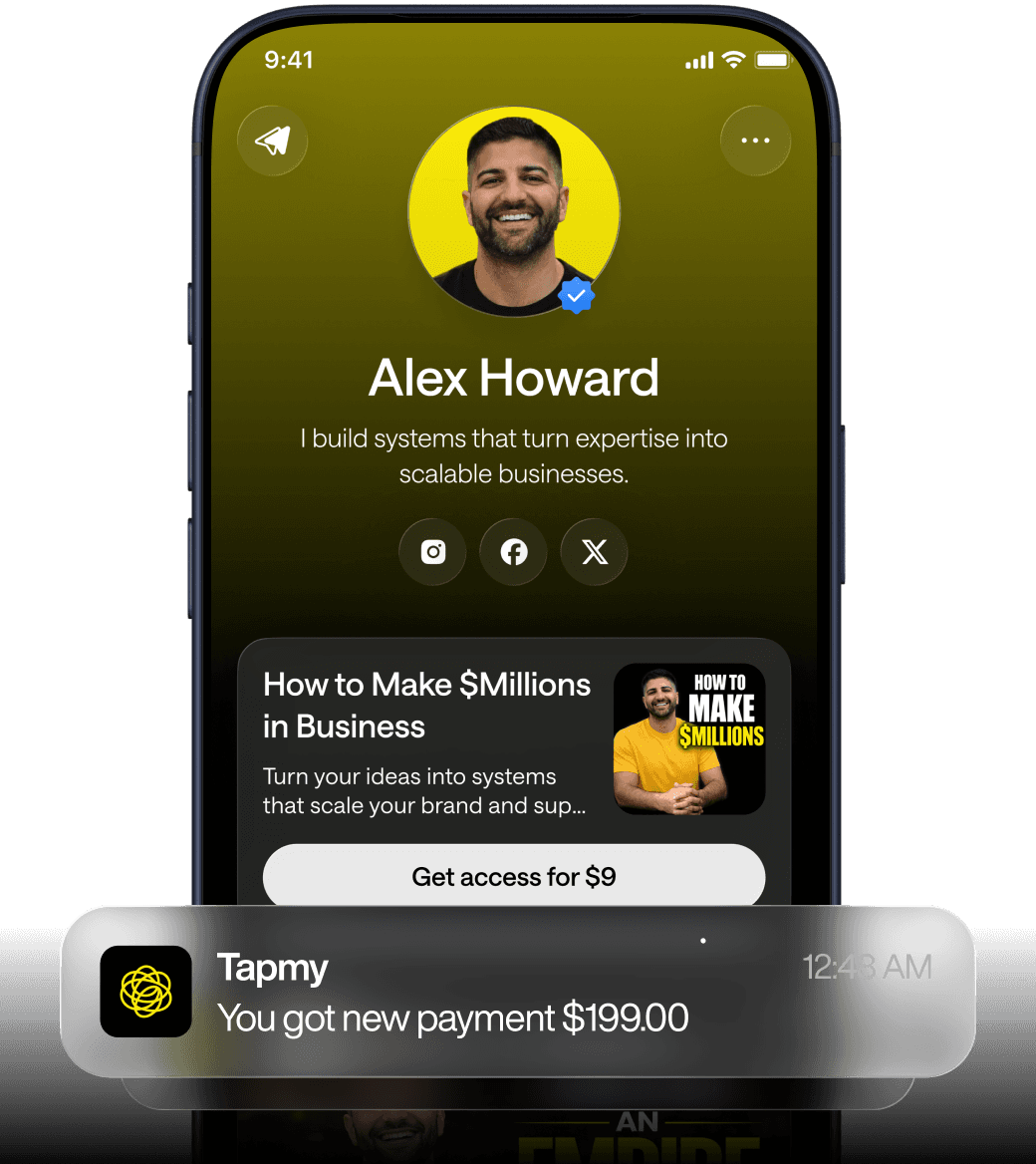
Pinpointing the thumb-zone: where primary CTAs should live on a bio link
Designers and engineers often place CTAs at the top because on desktop a top-left allocation aligns with scanning patterns. Phones invert that heuristic. When people hold a device one-handed — the most common pattern for social traffic — their thumb naturally occupies the lower two thirds of the screen. Heatmaps from ergonomic studies consistently show the bottom 1/3 as the “sweet spot” for single-thumb reaches. Place your high-value CTAs here and you reduce the physical effort required to act.
That’s only the start. Tap target size and spacing matter just as much. A visual button that looks tappable is not helpful if the CSS makes its interactive radius tiny. The mobile standard recommended by major platforms is a minimum of roughly 44–48 CSS pixels for touch targets; practically speaking, that translates to about 9–11mm on most phones. But size alone isn’t sufficient. Surrounding whitespace reduces accidental taps and increases perceived tappability.
Concrete layout guidance for bio link pages:
Primary CTA: place in the lower third of the initial viewport, above the fold as the user lands (not buried under images).
Secondary actions: group them below the primary CTA or in an easily scannable list; avoid inline links that require precise taps.
Spacing: at least 12–16px of clear space between tappable elements on small screens; more if adjacent elements contain different actions.
Sticky vs static CTAs: sticky bottom bars are effective when used sparingly — they occupy screen real estate but keep the action reachable.
Below is a compact decision matrix for CTA placement choices tailored to bio link contexts.
CTA Pattern | Best use case | Main downside |
|---|---|---|
Primary button in lower fold | Short funnel (one or two downstream clicks) | May reduce hero visibility; needs strong visual contrast |
Sticky bottom action bar | High-ticket or time-sensitive offers | Consumes vertical space on small devices; risk of accidental taps if buttons are too large |
Inline action cards (list) | Multiple similar links; discovery-oriented pages | Requires careful spacing; long lists push primary items off-screen |
Practical trade-offs exist. A sticky CTA improves reachability but reduces visible context above it. Your choice should reflect funnel length and expected user intent. For micro-conversion pages — a single product or a single offer — prioritize reachability. For discovery pages with many links, prioritize scannability and then highlight the most valuable action visually within the list.
How load time on mobile kills conversions (and what you can change under 3 seconds)
Performance is not abstract. For mobile-first bio link optimization, it's a direct lever on conversion. Use the rule of thumb provided in the depth elements: each extra second of load time reduces conversions by roughly 7% between 2s and 5s. If your page loads in 5 seconds rather than 2, you lose around 21% of potential conversions — from compelled visitors to silent exits.
That decline is multiplicative with other frictions. A slow page that also places the CTA out of reach compounds the loss. So prioritize speed first; then fix the interaction problems that remain. But what does “prioritize” mean in practice for a small bio link page? Here are targeted steps that deliver high impact for limited effort.
Remove blocking scripts from the critical path. Third-party trackers and analytics snippets are often loaded synchronously; defer them or load after interaction.
Inline critical CSS only for the above-the-fold content. Keep the initial payload tiny so the first meaningful paint arrives quickly.
Serve images responsively. Use srcset or picture elements and deliver modern formats (WebP, AVIF when feasible) at appropriate sizes.
Enable compression and caching. Gzip or Brotli at the server, and long cache lifetimes for static assets.
Reduce JavaScript bundle size. Trim frameworks or use code-splitting so only the minimal runtime ships initially.
When you are debugging, rely on measurable signals rather than gut feelings. FCP (First Contentful Paint), LCP, and TTI (Time To Interactive) are practical metrics. They point to specific bottlenecks: FCP issues often mean large CSS or slow server responses; LCP delays point to heavy hero images or third-party content; TTI delays indicate expensive JavaScript parsing.
Several trade-offs deserve emphasis. Removing a script improves speed but may reduce functionality or analytics fidelity. Compressing images can affect perceived quality. The right balance depends on the bio link’s role in the monetization layer: if the page is an offer endpoint with direct revenue attached, prioritize speed aggressively; if it’s purely discovery, allow slightly more visual richness.
Image, typography, and interaction rules for small screens without sacrificing clarity
Visual fidelity matters. But "fidelity" on mobile is not the same as on desktop. A sharp, correctly sized image and readable text are worth more than a decorative hero that delays interaction. Performance and legibility are linked; the visual choices you make change how quickly the page communicates value.
Image optimization checklist for bio link mobile pages:
Use responsive images with srcset and sizes attributes; pick breakpoints that reflect common device widths.
Prefer modern image formats (WebP/AVIF) where supported; still provide fallbacks for older browsers.
Apply lossy compression tuned to visual tolerance; for product thumbnails, higher compression is acceptable because the context is small.
Defer non-critical images with lazy loading; ensure LCP-critical elements are not lazy-loaded.
Typography decisions determine whether a visitor reads your CTA or taps another link. Small text that needs pinch-zoom is a silent conversion killer. Keep font sizes and line-height conservative for mobile: base font-size around 16px, heading scales that maintain hierarchy, and a line-height of roughly 1.3–1.6 depending on the font. Contrast matters; low contrast reduces perceived clarity, especially outdoors under bright light.
A short table clarifies trade-offs for image strategies:
Approach | When to use | Main trade-off |
|---|---|---|
High-res hero image | Branding-first pages where emotional impact matters | Slower load, potential LCP penalty |
Compressed thumbnails with focal crops | Product-centric bio links with many items | Less visual detail, but faster loads and scannability |
SVG icons and UI elements | Buttons, badges, small graphics | Small payload and crisp rendering; limited photographic use |
Micro-interactions — button presses, loading states, and transitions — are subtle but important. A button that shows immediate visual feedback on tap reduces perceived latency even if the network remains slow. Keep animations minimal and hardware-accelerated (transform and opacity only) to avoid jank. For checkout flows inside a bio link, show a progress state quickly so users know the page is responsive.
Where mobile checkouts in bio links break, and how to throttle the damage
When the objective is a transaction, mobile checkout is the most fragile segment of the funnel. Bio link pages introduce additional constraints: limited real estate, short attention spans, and often a lack of contextual trust signals. Several specific failure modes appear repeatedly.
Failure mode A — excessive form fields: asking for full billing address, separate phone, and multiple opt-ins will kill conversion. Each extra field increases cognitive load and the chance of abandonment. Keep required fields minimal; use address autofill, credit-card tokenization, and browser-provided payment APIs where possible.
Failure mode B — forcing users into new contexts: redirecting to external checkout or opening a large modal that hides the original content disrupts user flow. If you must defer to a third-party checkout, ensure the transition preserves the look and retains a visible progress indicator. Track these jumps with attribution; otherwise attribution vanishes and you cannot improve.
Failure mode C — keyboard mismanagement: failing to open the appropriate keyboard type (numeric keyboards for phone/CC fields, email keyboard for email) slows input and introduces errors. Worse, layout shifts when the keyboard opens can move the CTA out of reach. Build scrollIntoView behavior that stabilizes the CTA where appropriate, or use sticky footers that remain visible above the keyboard.
Trust signals and friction reduction:
Show minimal trust badges and a short payment summary near the CTA — not a lengthy privacy policy that requires scrolling.
Use explicit affordances for secure payment (lock icon, "secure checkout" microcopy) but do not overload the UI with multiple banners that compete with the CTA.
Offer guest checkout; avoid mandatory account creation in the funnel.
From a measurement perspective, ensure the monetization layer is instrumented properly: attribution + offers + funnel logic + repeat revenue. Attribution lets you know which upstream channels drive clicks; offers and funnel logic determine what the user sees and in what order; repeat revenue measurement identifies whether the mobile experience supports return buyers. Missing any of these reduces your ability to iterate on the checkout flow.
Finally, run experiments that reflect real conditions. Test under slow 3G and 4G profiles, not just in a high-speed office. Ask participants to hold the device one-handed and to use only their thumb. The difference between theoretical usability and practical usability is often revealed only in those constrained tests. If you need a quick setup for this, see our guide on how to create a bio link.
Practical audit checklist and device testing approach for bio link mobile optimization
Audits that stop at a desktop-sized viewport are useless. A practical audit for a creator’s bio link should combine automated metrics with rapid manual checks. The goal is to expose the exact interaction failures the visitor experiences in the first 10 seconds after landing.
Minimum automated checks:
Measure FCP, LCP, TTI under emulated 3G/4G in Lighthouse or WebPageTest.
Run a bundle analysis to identify large third-party scripts or oversized JS chunks.
Check image formats and compressed sizes; list the top three largest assets.
Minimum manual checks (performed on real devices):
One-handed thumb test: open the page, attempt the primary CTA without repositioning the hand.
Pinch-to-read test: verify whether any copy requires zooming to be legible.
Keyboard and form test: focus the email and phone fields, verify appropriate keyboard types and layout stability when keyboard opens.
Connectivity test: repeat basic tasks on a slow cellular network to reproduce real-world conditions.
Sample audit rubric (practical, binary checks):
Check | Pass criteria | Action if fail |
|---|---|---|
Primary CTA reachable with thumb | Can tap without repositioning hand | Move CTA to lower fold or add sticky bottom bar |
Load time under 3s (3G emulation) | FCP & LCP within 3s | Defer scripts; compress images; inline critical CSS |
Forms use correct keyboard types | Email field opens email keyboard, numeric opens numeric | Change input types and test again |
No horizontal scrolling | Content fits viewport width without pinch | Remove fixed-width elements; constrain media queries |
One last practical point about testing: automated tools can miss ergonomics. Run multi-user sessions with a mix of device sizes and hand positions. Watch for hesitation, repeated taps, and scrolling patterns. Those behaviors are more predictive of conversion metrics than even the best Lighthouse score.
FAQ
How do I decide between a sticky bottom CTA and a prominent in-list CTA for my bio link?
It depends on funnel length and the number of choices you present. If the page is single-offer or the conversion requires one main action (buy, book, sign-up), a sticky bottom CTA reduces physical friction and usually performs better. If you present multiple equally important links (album of songs, multiple products), an in-list primary CTA that appears high in the visible list maintains context and avoids consuming screen real estate. Test both on a small audience segment; measure not only clicks but downstream conversions and return rate (repeat revenue). For guidance on funnels and repeat purchases see revenue funnel.
My hero image looks important, but it pushes the CTA out of view. Should I remove it?
Not necessarily. Consider replacing the hero with a compact version or crop that preserves the brand cue but reduces height. Alternatively, move the hero below a compact information block that contains the CTA and the core value proposition. The priority is to communicate the offer quickly and keep the primary action reachable. If the hero is crucial for trust on specific offers, keep it but optimize for size and load order so LCP remains fast.
Are modern image formats always better for mobile bio link optimization?
Modern formats like WebP and AVIF generally offer better compression for photos and can reduce payloads significantly. But browser support and encoding complexity matter. Use a server-side or build-step fallback strategy: serve WebP/AVIF where supported and provide JPEG/PNG for older browsers. Avoid the trap of re-encoding without checking visual quality — overly aggressive compression on product images can reduce perceived value. For practical tooling, check our roundup of tools that creators use to optimize assets.
How much does deferred analytics impact my ability to iterate on mobile experience?
Deferring analytics until after first interaction reduces initial payload and speeds up FCP/LCP, which benefits conversion. The trade-off is that you lose reliable visibility into users who drop before interacting. A pragmatic approach is to send a minimal beacon at first paint with essential UTM and referrer data (small, cheap), and then load full analytics after interactivity. That preserves attribution for non-interactors while keeping the critical path light. See our piece on analytics for recommended events.
What’s the quickest fix for creators seeing 70%+ bounce rates from bio link pages?
Start with three rapid checks: ensure the primary CTA is reachable without pinch-zoom; verify base font size is at least 16px and readable without zoom; and measure load time under a slow cellular profile. Often, addressing any one of these gives immediate improvement. But be cautious: changing one element can expose another bottleneck. Iterate with short A/B tests and real-device measurements rather than relying solely on emulators. For testing methodologies, review our A/B testing framework.